This pile of pebbles have been sat in my studio for some time now, patiently waiting to be painted…

When I had finished painting this, I didn’t like it at all. So I just left it on my desk and walked away from it. When I returned to it a while later, I realised it was not as bad as I first thought. It’s not “perfect”, but not a disaster either! Lesson to be learnt here is to never make hasty judgements about my art. This is one of those paintings that looks better if you view it from a bit of a distance…
The colours I used were Buff Titanium, Flint Grey, Jane’s Grey, Monte Amiata Natural Sienna, Ultramarine GS and Quinacridone Burnt Orange. The paper is Baohong Masters’ Rough, 15 cm x 23 cm. I think this will go in my current sketchbook, as there are things I do like about it and things I can learn from it. I’ll have another go at painting these pebbles. Something else I’ve learnt while painting this, is that it may have been easier to paint this if I had used larger paper… !!
This is my watercolour interpretation of a blue-grey whelk I found on the beach a few weeks ago. I had to wade through a fairly deep, freezing cold rockpool to retrieve this shell!

It is painted on Baohong Masters’ rough paper, 15 cm x 23 cm. Colours used were Buff Titanium, Ultramarine GS, Jane’s Grey and Flint Grey. Also, I painted this about 4 x larger than the actual size of the shell. To help me get the scale and proportions right I used this:
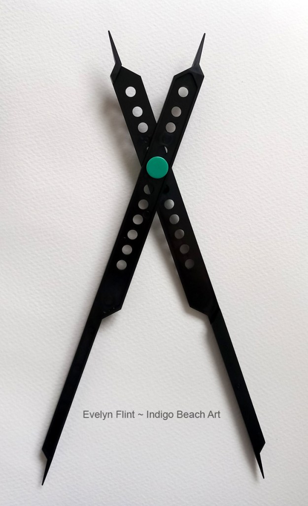
This is a really useful drawing tool. It’s adjustable, so I can draw things to scale (larger or smaller) in an assortment of different ratios.
Moving forward, lessons have been noted and learnt from these paintings. I will try to put into practice what I’ve learnt in my next painting session…

1 Comment