Transparency & Opacity

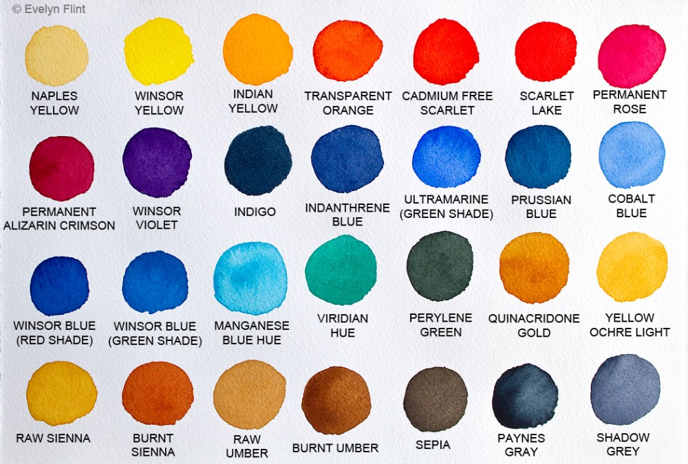
Watercolour is a beautiful transparent medium. But not all watercolour shades are fully Transparent (T) – some are Semi Transparent (ST), Semi Opaque (SO) or Opaque (O). It’s important for me to know this information about my watercolours because it will affect the way the colours behave on the paper when painting. So, I decided to test out some of my colours to see how transparent they really are:

Above I tested 40 colours – the 28 colours in my palette, plus 14 others just to fill up the paper; all colours are Winsor & Newton unless otherwise stated. I used Arches Cold Pressed watercolour paper and began by making vertical black lines with a black Sharpie pen which is permanent and waterproof. Then painted my colour samples, in a single layer, over the top and I was fairly generous with the paint to maximize their covering power.

Now for the results… !! The colours I knew to be transparent (all Winsor & Newton) performed exactly as I expected – they are absolutely Transparent, which makes me very happy. But some of the Semi Transparent colours surprised me… but in a good way; Indanthrene Blue, Cobalt Blue and Olive Green are classed as Semi Transparent by their respective manufacturers, but from my tests above I’m quite happy to regard these 3 colours as Transparent! I wasn’t expecting that! Another surprise in the Semi Transparent range was Winsor Yellow – it’s only just in the Semi Transparent range and is very very close to the Transparent end of the opacity scale… that pleases me too!

A few more surprises… !! Naples Yellow, Cadmium Free Scarlet and Cadmium Free Yellow are all classed as Opaque by Winsor & Newton, but from my experiments above I would definitely put them in the Semi Opaque category. I’m completely OK with that. My next happy surprise was Payne’s Gray… it’s Semi Opaque still but definitely edging towards the Semi Transparent side of the opacity scale, not quite as opaque as I thought it would be and I would say the same for Yellow Ochre Light too… interesting! Finally, in my colour samples above, I only have two colours that I regard as fully opaque – Indigo and Sepia. And I love them! They are beautiful colours!

I created the diagram above to illustrate how I view transparency/opacity in watercolour. On the far left of the scale is the pure white paper, which reflects the maximum amount of light. On the far right of the scale is where fully opaque paint prevents light being reflected off the surface of the paper. And all watercolours will fit somewhere in between these two extremes. Transparent watercolours allow the most amount of light to be reflected off the surface of the paper through transparent layers of watercolour paint, creating radiant paintings; Opaque watercolours allow the least amount of light to be reflected off the surface of the watercolour paper. Of course, a very thin/dilute layer of Opaque watercolour will be transparent… and likewise, a very thick layer of Transparent watercolour will be more Opaque.

In conclcusion: It’s always a good idea to take note of the information supplied by watercolour manufacturers about their watercolours. But, ultimately, I feel it’s better to test them out for yourself and make your own judgements about them! I’m very happy with all of the colours in my palette and wouldn’t change any of them. There were no unpleasant surprises at all. And I love the high level of transparency in my Winsor & Newton Palette. Happy days! Why not test your watercolours out, and see what surprises you get!

Happy painting!

Beach Books & Beach Colours

My own hand crafted sketchbook

Already we’re a quarter of the way through a new year – where does the time go! I have always found it near impossible to find what I consider to be the “perfect” sketchbook for watercolours. And I’ve tried a lot! So, late last year I decided to make my own! I threw myself, straight in the deep end, into the wonderful world of book binding. Above is one of my earliest hand crafted, hard backed, multi section sketch books. This particular sketch book is landscape orientation, measures 6.5″ x 5″, and has 32 pages of 100% cotton, 300 gsm, cold pressed watercolour paper.

For me personally, this is the only way I’m going to have sketchbooks for watercolour painting that I’m happy with. The sand coloured sketchbook above is A5 landscape. These sketchbooks will fit neatly into a bag and are perfect for taking to the beach (or anywhere else) for watercolour sketching…

With book binding, there is a lot to learn. I’ve had to buy supplies/tools, but most of the tools needed for book binding at home are relatively simple and inexpensive. I love book binding! For me, this is the way forward – I may never buy another watercolour sketchbook again… !

The Spring of last year saw a big change in my watercolour journey. I hadn’t been liking the art I was creating, but couldn’t quite put my finger on the problem. I tried different paper, brushes and techniques etc. but still I wasn’t happy with my art. Then one day in spring 2025, something happened (doesn’t matter what it was) and all of a sudden the “problem” was staring me in the face. GRANULATION. Or to be more precise, excessive amounts of granulation! It was a revelation to me! Why hadn’t I realised that sooner? This eureka moment prompted a re-evaluation of my entire watercolour collection – 95% of which were Daniel Smith watercolours. At this point, I would like to state that I do like granulation. BUT, I want the granulation on my terms – when and where I want it. I don’t want granulation in everything!

This is just a small amount of the watercolours I gave away…. !!

I immediately began sourcing watercolours that don’t granulate. It didn’t take me very long to find what I was looking for… and I found watercolours I love, with minimal granulation, in the Winsor & Newton Professional Watercolour range. I realised then that I would never use the majority of my Daniel Smith watercolours ever again so, along with some other colours I didn’t want, I gave 95% of them all away – hundreds of pounds worth – to my artist sister! I’m sure I hear some gasps of horror out there… but I did what I had to do. I was ruthless. Also, I was following my own advice at the bottom of the My View Of Colour page – MOVING FORWARD point 1.

These are the colours now in my palette…

28 colours – 27 Winsor & Newton Professional and 1 (Shadow Grey) by Schmincke

The number of colours I now use is significantly less than before – my palette is much simpler and the colours are fairly traditional – but I love them. Winsor & Newton Professional Watercolours are pigment rich and vibrant, with beautiful clarity and transparency. It’s funny because I started out on my watercolour journey with Winsor & Newton watercolours, I got side tracked… but now I’ve come home.

Finally some colour mixing fun:

Above and below, I’ve been mixing Schmincke’s Transparent Ochre with colours from my palette. The result are some beautiful beach colours, based on what I see around our beautiful UK coastline. All colours are Winsor & Newton Professional watercolours unless otherwise stated…

I’m going to keep these colour mixes nearby when I’m painting for quick reference. Any appearance of granulation in these colours is mostly from the texture of the rough paper that I have used – not from granulating watercolours. Also, my DSLR picks up more detail than you can see with the naked eye!

I’m still caring for my beautiful mum full time (24/7) but I’m very happy to be sharing this labour of love with my sister, we’re in it together. But caring for mum does make finding time to paint very difficult. But my watercolour journey continues. I snatch moments of time to paint as often as I can. That’s all for now – happy painting!

Abstract Landscapes

Well, it’s been quite a while since my last post. But, in my watercolour world, things have been moving along quietly in the background.

Abstract watercolour landscape

Above is a very simple abstract watercolour landscape on Daler Rowney Langton Prestige 100% cotton watercolour paper. I used just two colours – Ultramarine (Green Shade) and Transparent Orange, both by Winsor & Newton. I love these colours together. The next few watercolours are colour experiments in the form of abstract landscapes…

Winsor Blue (Red Shade) and Sepia by Winsor & Newton on Millford watercolour paper.

Winsor & Newton’s Prussian Blue and Burnt Umber on Aquarelle Arches cold pressed paper. I love these colours together…

Above left I used Payne’s Gray, Van Dyke Brown and Raw Sienna; in the middle I used Ultramarine (Green Shade), Burnt Sienna and Raw Sienna – this is one of my favourite colour combinations: on the right I used Payne’s Gray, Sepia and Raw Sienna. Paper used was Aquarelle Arches cold pressed.

Driftwood – watercolour sketch
Limpet – watercolour sketch

A couple of little sketches of some of my beach combing finds. The colours used were Yellow Ochre Light, Payne’s Grey, Ultramarine (Green Shade), Raw Sienna and Burnt Sienna. The paper used was Daler Rowney Langton Prestige watercolour paper.

I’m still caring for my beautiful mum full time, she will always come first. So my watercolour painting has to take a back seat, and finding time to paint regularly is super challenging. I have to snatch small moments of time here and there, when I can. I’m fortunate that I do have space to paint at my mum’s and my equipment it all set up to be used at a moments notice.

I have updated my Watercolour Materials and My View Of Colour pages, so please take a few moments to have a look. That’s all for now, and I’ll try not to leave it so long before I post again…

Happy painting!