Ravine

Ravine ~ abstract watercolour landscape

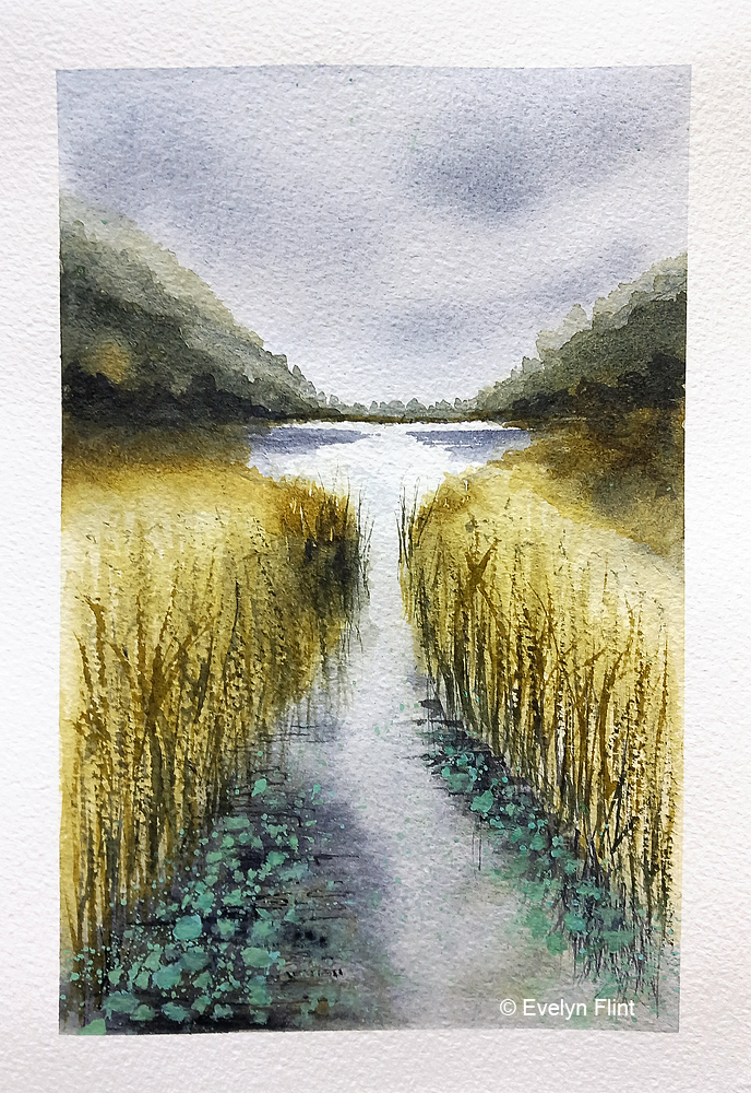
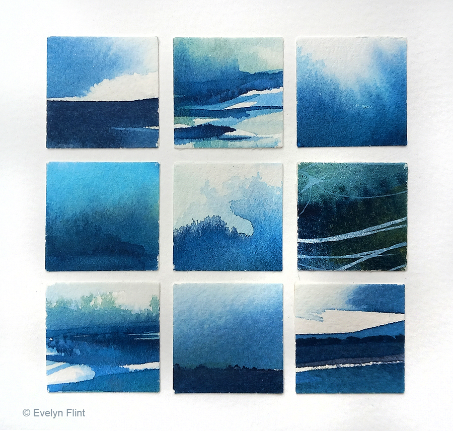
Above is a beautiful abstract watercolour landscape painted spontaneously. I used just two colours – Indigo (W & N) and Undersea Green (DS); this is a colour combination I’ve used before and I like it very much. The paper I used is Daler Rowney Langton Prestige watercolour paper, 140 lb rough, 100% cotton. This is lovely paper to paint on.

I’ve also painted a few sea shell sketches:

Cockle Shell ~ watercolour sketch

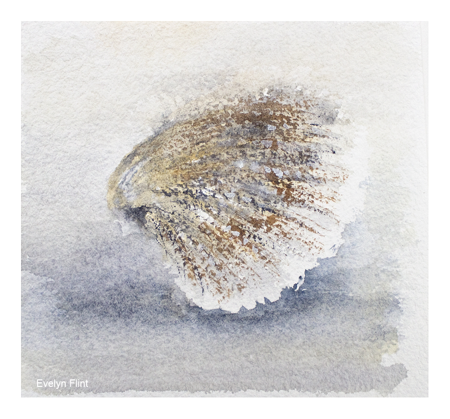
Above a little cockle shell sketch. Colours used were Buff Titanium, Flint Grey, and Transparent Sienna. The paper used was Baohong Cold Pressed, 140 lb. The lovely texture of this paper is great for helping create the texture of these shells. Negative painting and some dry brush work were some of the techniques I used.

Mussel Shells ~ watercolour sketch

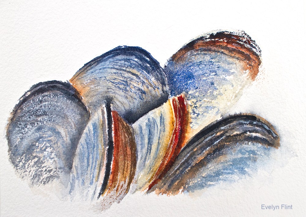
The mussel shells above was a little practice sketch, using one of my own photos for reference. I was testing out colours and creating textures using Baohong Cold Pressed paper and dry brush work. The colours I used were: Ultramarine Blue, Indanthrone Blue, Jane’s Grey, Transparent Sienna, Transparent Ochre and Permanent Alizarin Crimson. I’m going to do more sketches like the one above, applying the lessons I’ve learnt.

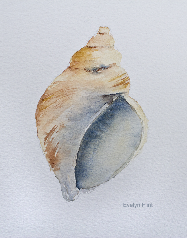
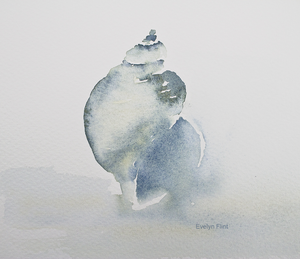
Above are a couple of whelk watercolour sketches. The one on the left slightly more detailed, painted on Daler Rowney Langton Prestige watercolour paper; the one on the right painted more loosely on Canson Moulin du Roy watercolour paper.

As a full time carer for my beautiful mum, finding time to paint is challenging. My mum will always come before my painting. But I am able to snatch small moments of time to paint. I’ve had to completely rethink how I’m able to paint now and adapt to my changed circumstances. Recently I have been able to try some different watercolour papers and a few new colours. My watercolour journey will continue…

Course Work

Above is a landscape I painted as part of Maria Wigge’s Creating Boldly With Watercolor course. Maria provided the source photo and demonstrated how to paint it in a loose style. I generally don’t follow tutorials anymore (see below), but I carefully watched Maria’s demonstration and then did completely my own version – I used my own selection of colours and just a very minimal pencil sketch. I really like how this turned out. I showed my sister this painting and she fell in love with it…. so it’s gone to a lovely new home!

Above is a seascape also created as part of Maria Wigge’s Creating Boldly watercolour course, link above. The source photo was Maria’s and she also demonstrated how to paint it in a loose style. But I painted my own version, using my own colour selection and just a very minimal pencil sketch. I have officially now completed the Creating Boldly With Watercolors course, but I will be revisiting it from time to time. I’m now focusing on the Diving Deeper With Watercolors course by Maria Wigge, but I’ll be incorporating lessons learnt from the first course into my work for this course.

Above I mentioned that I, generally, don’t follow tutorials any more. Why not? Because when I follow a tutorial I’m simply copying the work of another artist, and the work created will never be my own work – it will always be the work of the artist who created the tutorial. I don’t want to be someone who simply copies another artists work. Also, the danger with following tutorials is that, if I’m not careful, I will be following tutorials forever…. ! I don’t want to do that either. So I decided some time ago to STOP FOLLOWING TUTORIALS. I like to watch a tutorial to learn techniques and get ideas that I can incorporate into my own work. But that is all. I want to create my own unique, original artwork.

Happy painting!

Rocks & Seascapes

Above I’ve been painting rocks for Maria Wigge’s Diving Deeper With Watercolors course. This was purposely a monochromatic study, focusing on getting a full range of tonal values, plus creating the 3D shapes of the rocks. More rocks/pebbles practice will continue. For this exercise I used just Payne’s Grey on Milford paper.

Layers – an exercise in creating layers for Maria Wigge’s Creating Boldly watercolour course

The layers exercise above was painted on Fabriano Artistico 140 lb rough paper. Colour used was Payne’s Grey. I painted the sky area first; then I worked on each layer of mountains, starting with the lightest (at the back) to the darkest at the front. It’s so important to let each layer dry completely before starting a new one. This was also a very simple lesson in aerial perspective – light cool tones recede into the background and warmer darker tones come forward. I will do another one of these exercises with different colours to illustrate this more fully.

A simple loose watercolour seascape, although it started out as sky practice for Maria Wigge’s Diving Deeper With Watercolors course. Colours used were Phthalo Blue Red Shade, Hansa Yellow Medium, Jane’s Grey and Buff Titanium. I created deliberate watermarks to depict the waves at the shore line; it’s a tricky, slightly unpredictable technique but one I love to do.

Another sky practice piece that turned into a little seascape. Colours used were Ultramarine Blue, Cobalt Blue, Jane’s Grey and Buff Titanium. Both paintings above were painted on Arches NOT 140 lb paper.

Abstract Indigo Seascapes & Landscapes

When painting efforts don’t go to plan, it’s so easy to just throw them away. Instead I examine them first and see if there’s anything at all I like – usually there is something. Above is a mosaic of small squares cut out from work I didn’t like as a whole. Put all together they make a beautiful new piece of art. And each square may provide inspiration for a new larger piece of work. Happy painting… !