Welcome to the new home for Indigo Beach Art!
This website is still under construction, but more content will be added over the coming weeks. Please feel free to LIKE, SUBSCRIBE, FOLLOW and COMMENT.
I hope you enjoy your visit here.
Evelyn
Exploring the beautiful world of watercolour…..
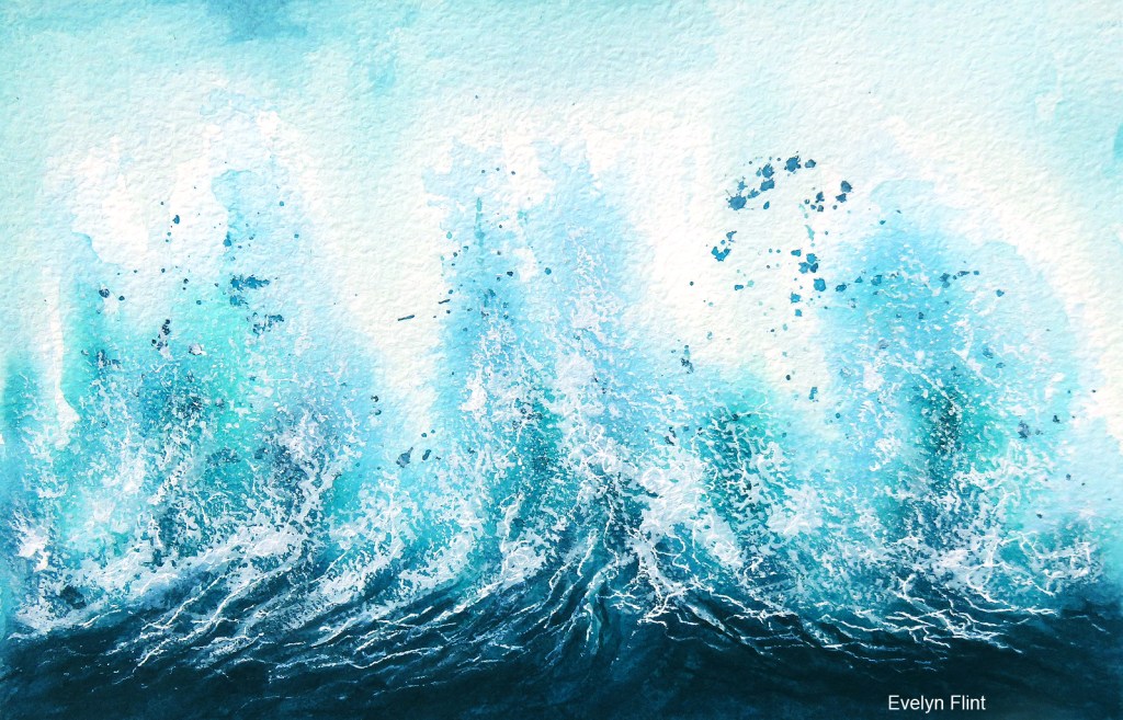
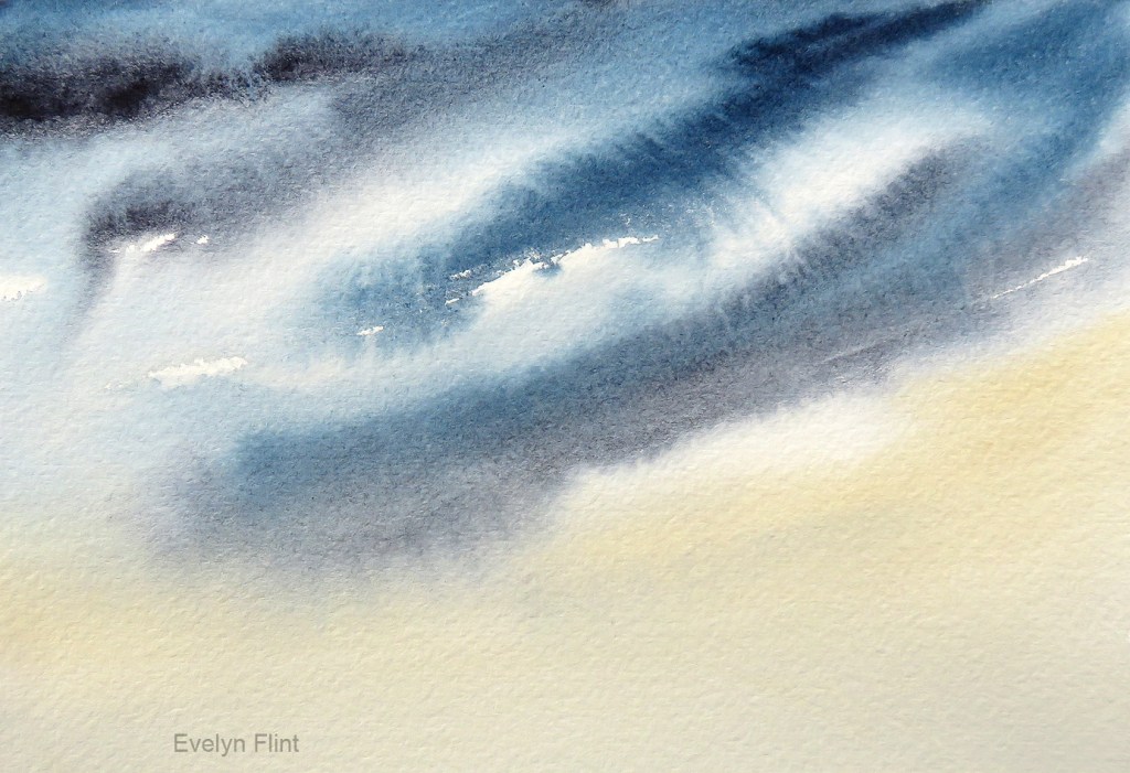
For the seascape above I started out with no agenda, I was just going to play with a few colours. I started out with Winsor & Newton’s Indigo and started painting from the top of the paper. I then used water from a spray bottle (not too much!!) to encourage it to run down the paper a little. I then added some Phthalo Blue Turquoise (DS) because it’s a colour that complements W/N Indigo perfectly. I then turned my paper “upside down” so the colours wouldn’t run down the paper too far, the paper being at a 45° angle. That was when I could see a seascape appearing…
I decided to “run” with the seascape idea. I added some Prussian Blue and some Ultramarine Turquoise, both by Daniel Smith. I added some more Indigo to create some darker tones and finished off with some W/N Titanium White for the sea spray.
It was painted on Baohong Master’s Choice rough paper and measures 15 x 23 cm. This will go into my sketchbook (with notes) for future inspiration. I may do something like this on a larger scale and maybe experiment with different colour combinations…
Next some sky practice inspired by Lois Davidson on YouTube…
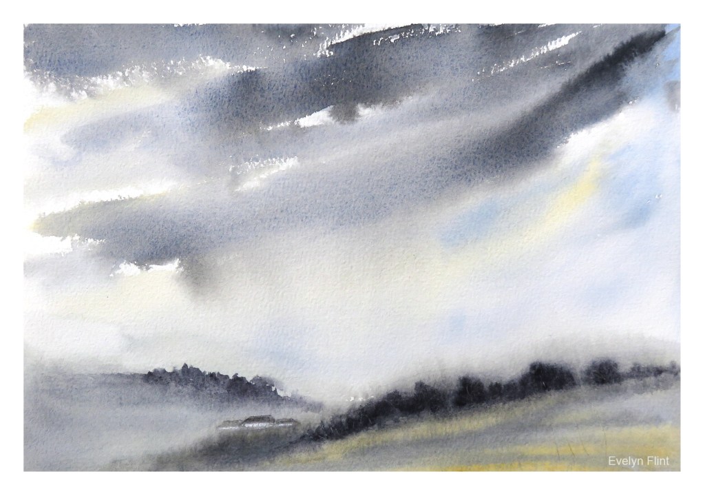
For the moody, stormy sky above I used Cotman Payne’s Grey, Ultramarine GS (W/N) and Raw Sienna Light (DS). I love Cotman’s Payne’s Grey – it’s transparent and I love how the colours separate out when you add lots of water to it. I added a very simple landscape to the bottom just to give some context for the sky. This will go into my sketchbook.
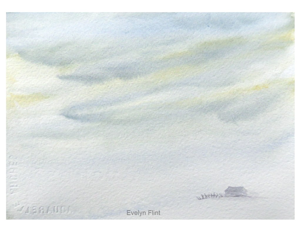
A very simple cool wintry sky above. I just used Ultramarine GS and Raw Sienna Light. I like how these two colours interact together. This sky lent itself to being a snow scene so I added a little building with a fence, to indicate it being surrounded by snow. Of course, this is not a finished painting – it’s just me putting ideas onto paper.
Another stormy sky above. For this I used W/N Indigo, Jane’s Grey and Raw Sienna Light. I tried to make sure I left some light areas in this sky. I’ve discovered that if you want white areas in a sky then it’s best to leave them white in the first place, rather than lifting out colour afterwards. It’s always very easy to add colour to a white area in a painting, but not so easy to lift it out afterwards… !
If you have a chance, please to take a look at Lois Davidson’s YouTube channel. There’s always lot’s of lovely, inspiring things to watch and learn from. At this point I will mention that, technically speaking, I now have a YouTube channel – which you can view HERE if you wish. BUT I have no intention of adding any videos! I created it so that if I decided to leave a comment on a YouTube video, then anyone reading the comment can view a page to find out a bit more about me and where I display my art. The only other thing you will see there are a few channels that I have decided to feature as these are the channels I visit most frequently on YouTube.
That’s all for now, and I hope you’re able to find time to do something creative today!
