INSTINCT: I love colour. I always have and always will. Most of the time, choosing colours that work well together in a painting is something that comes naturally to me, it’s instinctive. To me, colours either “look right” together or they don’t. If the colours don’t “look right” I have to identify which colours are wrong, why they’re wrong (if possible) and then remove them from my selection for that particular painting.
CHOOSING COLOUR: For me having a wide range of beautiful colours to choose from is essential. I like to have choice – I don’t like to limit my options! And I love to experiment with colour. The number of colours I use in a painting varies enormously, sometimes just two or three, sometimes it might be five, six or more! The actual colours I use may vary enormously too, depending on what I’m painting. I will always test out colours on a separate sheet of paper first before deciding which colours to use for painting.
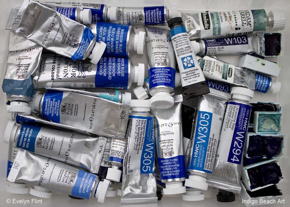
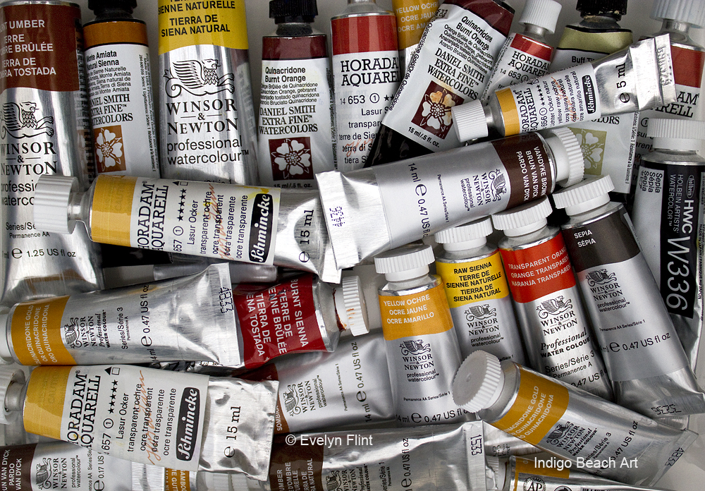
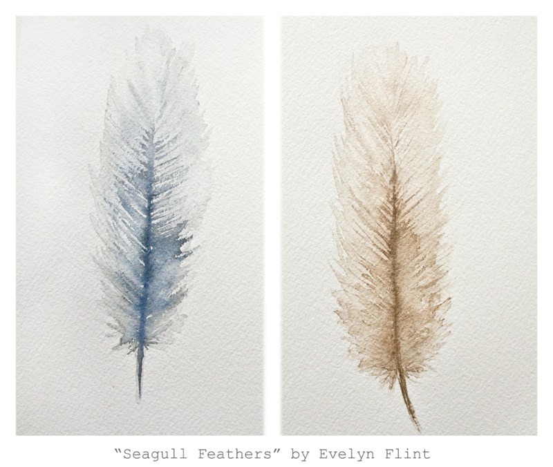
Blues and earth colours dominate my watercolour collection. Why do they dominate? I can only assume that it reflects my love of the ocean, the coast, the beach and the sea shore.
A COLOUR CHALLENGE: Of the three primary colours used in painting – red, yellow and blue – red is my least used colour.
I have a problem with red. I don’t understand why, I just do. I do like red. BUT, I am very picky about what reds I like and will use in my art. There’s a large number of reds I don’t like and choose not to use.
However, I do appreciate that red is an indispensable, essential part of an artists palette and I have found four reds that I love to use. They are: Cadmium Free Scarlet, Scarlet Lake, Permanent Rose and Permanent Alizarin Crimson, all by Winsor & Newton. Now, I pretty much just stick to these for my primary reds.
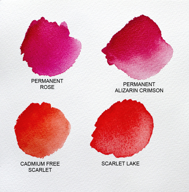
Cadmium Free Scarlet and Scarlet Lake are warm reds, Permanent Rose and Permanent Alizarin Crimson are cool reds.
Red is a challenge for me.
Fortunately for me, I do like quite a few earth reds like Burnt Sienna, Burnt Umber, Vandyke Brown, Sepia, to name just a few.
I realise that my issue with red might seem really strange to many people. I know it’s not logical. But it’s part of my artistic personality. I can’t change it or ignore it. So I accept it and work with it.
COLOUR THEORY: When it comes to colour, I will trust my own judgement first and foremost. Always! But I do firmly believe that it’s important to have a good basic understanding of colour theory. For me, my natural instinct for colour and my basic understanding of colour theory work really well together.
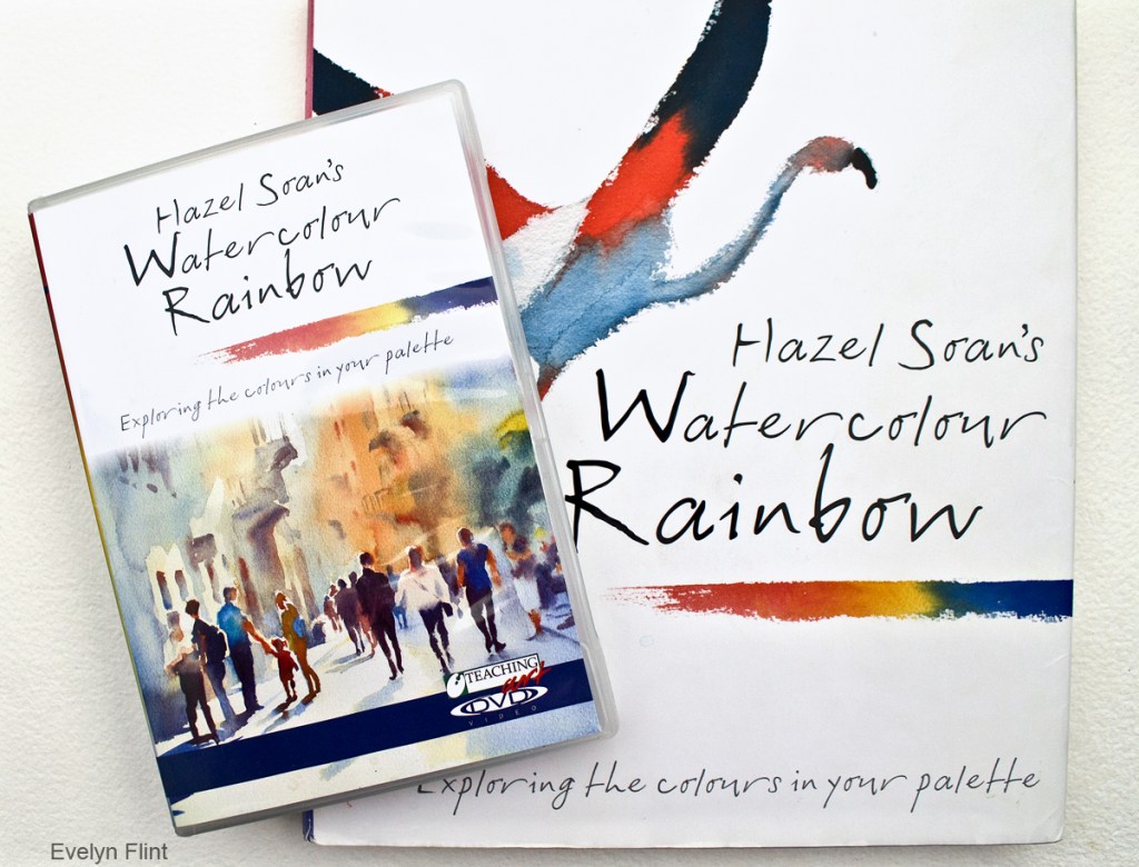
I have gained my basic understanding of colour theory from Hazel Soan. Her book, Hazel Soan’s Watercolour Rainbow, and accompanying DVD were a real eyeopener for me!
Only after reading this book and watching the DVD (many times!) did I truly start to understand the nature of the colours in my palette for the very first time. Learning that the three primary colours (red, yellow & blue) mix together to create browns, greys and black was a revelation to me! And therefore colours opposite each other on the colour wheel (complementary colours) will also mix together to make browns, greys and black. When I learnt this, I got my reds, yellows and blues out and started mixing them – the results were amazing; this was a game-changer for me.
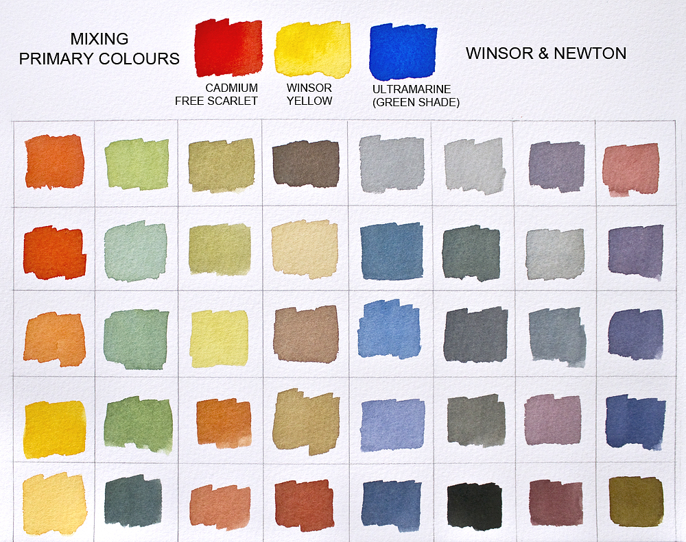
Above is just one example showing some of the colours you can create (including black!) by mixing a red, yellow and blue. The different combinations of red, yellow and blue you can use for a chart like this are almost infinite, due to the enormous choice of watercolours available today.
Learning that opaque, semi opaque and some of the more heavily granulating colours are made of heavier particles that move more slowly across the paper, and that transparent colours are made from much finer, lighter particles that will move more quickly across the paper, is invaluable. I’ve made a point of learning the properties of ALL my colours.
Truly understanding about warm and cool colours was so useful. I’ve learnt so much more – too much to relate here.
The bottom line is this: for me, learning about basic colour theory makes choosing the right colours for a painting so much easier; it decreases the chance of unpleasant colour “surprises” and increases my chances of creating radiant, vibrant watercolour paintings.
MY PALETTE:
I have a large porcelain studio palette, which you can see HERE, but below is my travel palette:
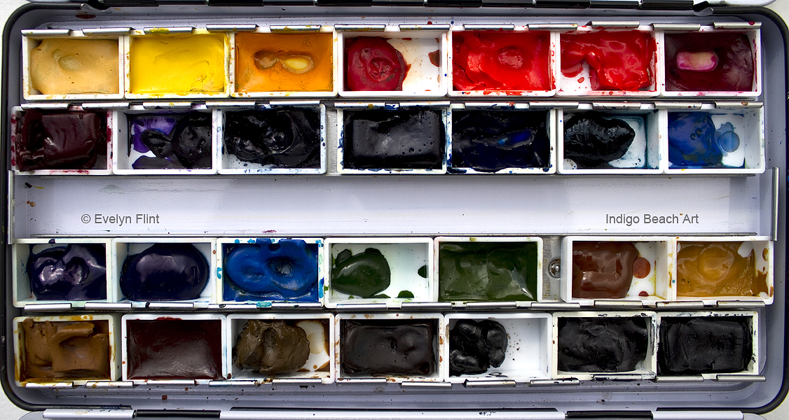
It contains 28 colours which I use on a regular basis; 27 are Winsor & Newton Professional Watercolours, one is by Schmincke. I can paint pretty much anything I want with these colours. But, I also have my secondary palette…
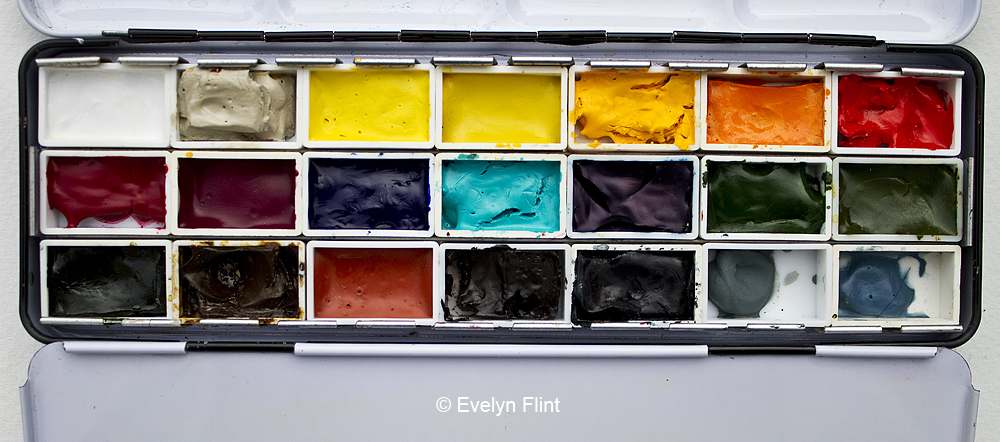
My secondary palette is within easy reach at all times and I dip in to it regularly. All these colours supplement my travel palette very nicely and give me that good range of colours and choice I need. The pans in both paint boxes above are all filled with tube paints and they re-wet very easily. I know the names and properties of all the colours in my studio palette and my secondary palette (I know some of the pigment numbers too, but not all of them… sometimes the numbers just stick in my head… !).
Each colour in my studio palette or secondary palette has to stand on it’s own individual merits as a watercolour, irrespective of what brand it might be. Every single colour, in both my palettes, has to work for me as a stand alone colour first and foremost; and then they also ideally have to be colours I’m happy to mix with too. Any colours I am not completely happy with, for any reason at all, will be evicted from my palettes, or wont even make it into my palettes in the first place! When I try new colours I tend to find a space for them in my secondary palette so I can try them out over a period of time – they’re “on probation”. If they work for me, they stay and if they don’t, they go!
MOVING FORWARD: What advice would I give to anyone who struggles with colour, colour mixing or choosing the “right” colour combinations for painting? Here are a few suggestions that may help:
1. Get all your watercolours out and swatch them out on a sheet of paper…
- Look at them. Are there colours you really don’t like and/or wont ever use? Then GET RID OF THEM – you don’t need them! It’s very liberating! Give them to an artist friend who does like them and will use them, that way they’re not being wasted. Don’t paint with colours you don’t like, just because a well known/favourite artist uses them. Find alternative colours you do like, make your own choices – there’s an enormous variety to choose from out there!
2. Play with colour!
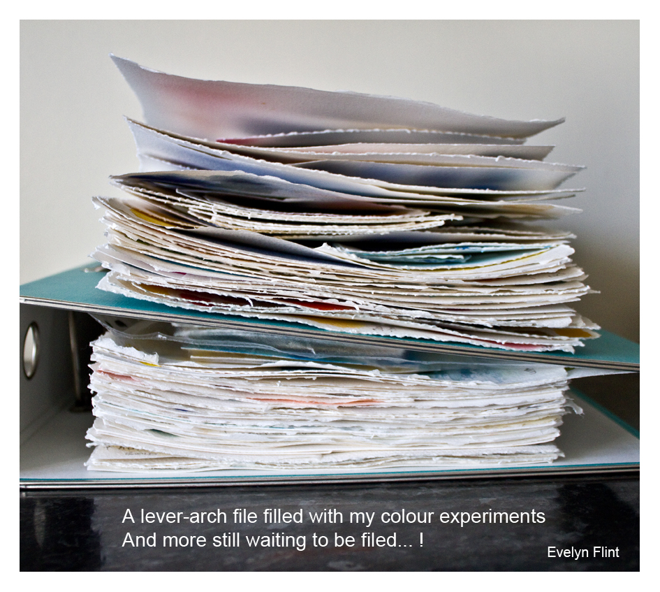
- Give yourself time on a regular basis to simply play and experiment with colour. You’re not creating a masterpiece, you’re just having fun with colour. It’s very relaxing and therapeutic! Why not fill a sketchbook with colour experiments? Note what you like and don’t like, names/brands of colours you’ve used, how certain colours react together, how you can use those colours in a future painting…
- Get to know all your colours really well – are they transparent/opaque? Do they granulate? Are they warm or cool colours? What happens when you mix them with other colours?
3. Learn basic colour theory!
- Learning the basics of colour theory is extremely helpful to the creative process. You don’t have to make a science of it or be a slave to it. But your art work will benefit enormously from it. There are plenty of resources out there to help you – books, websites, YouTube videos, workshops etc.

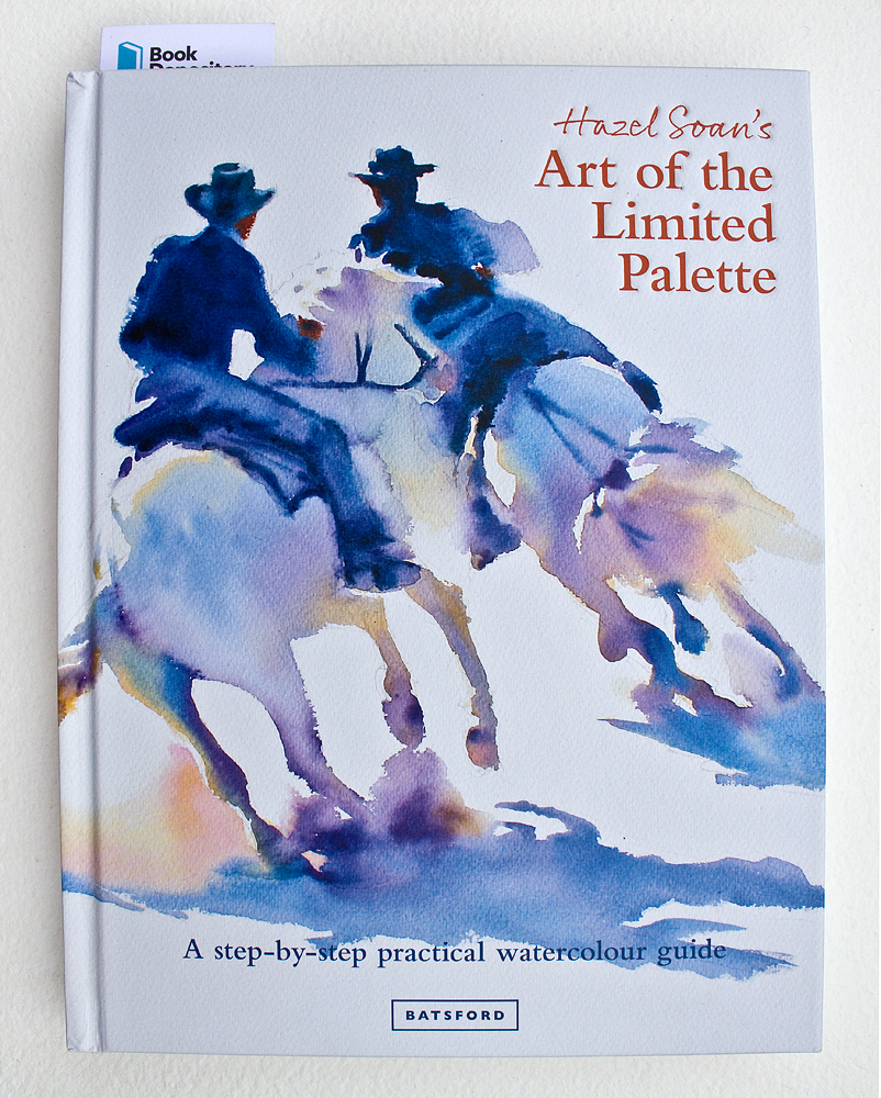
Above and below are examples of two books that may help you learn about colour…
4. Try out new colours from time to time…
- Try out new colours, different brands – it might give your art a new perspective. Of course, there’s nothing wrong with the tried and tested colours we know and love but it’s also good to push ourselves out of our colour comfort zone from time to time – you may be amazed with the results!
5. Getting to grips with colour is something you have to do for yourself
- No one can do this for you. I had to do it for myself. We’re all unique, individual and diverse as artists. Therefore, our colour choices will also be equally unique, individual and diverse. Colourwise, I know what’s right for me. Only you can discover what’s right for you.
I’ve enjoyed sharing my unique view of colour and providing a little insight into my colour process. I hope it’s given you something to think about. I hope I may have inspired you to sort through all your colours, looking at them all with fresh eyes and renewed enthusiasm. Everyone can learn to be bold, brave and confident in their personal colour choices.
You can view the full range of watercolour materials I use here:
Happy painting!
Evelyn
Updated October 2025
