In this post I would like to briefly cover two things:
- The abstract watercolour mosaics
- The unique, one-of-a-kind, customized sketchbook the mosaics are displayed in
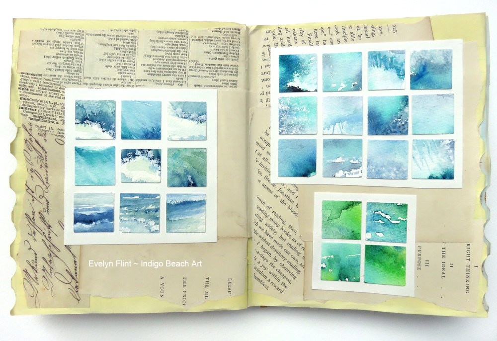
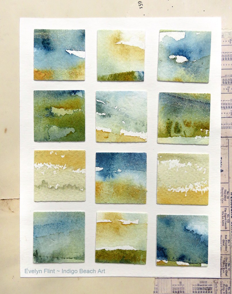
Let’s start with the watercolour mosaics. Each of these little squares above are beautiful, original, inspirational, abstract watercolour seascapes. They all started out as larger paintings or experiments that “didn’t go to plan”. All artists have them! I cut them up into 1 inch squares, picked the ones I liked best and arranged them in a grid on some white cartridge paper.
This is a wonderful way to create beautiful, new, original art from those paintings we, for some reason, are not happy with! Each little square can be inspiration for a new larger piece of art. The squares above I see as landscapes. The colours are Ultramarine Blue, Prussian Blue, Raw Umber and Burnt Umber.
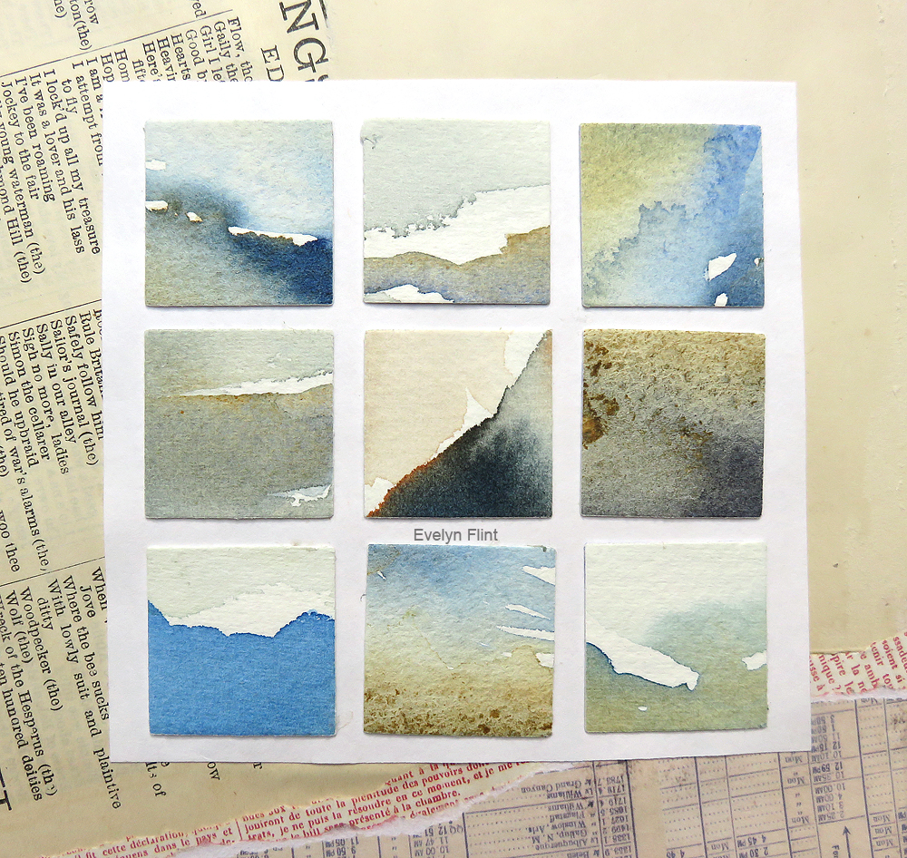
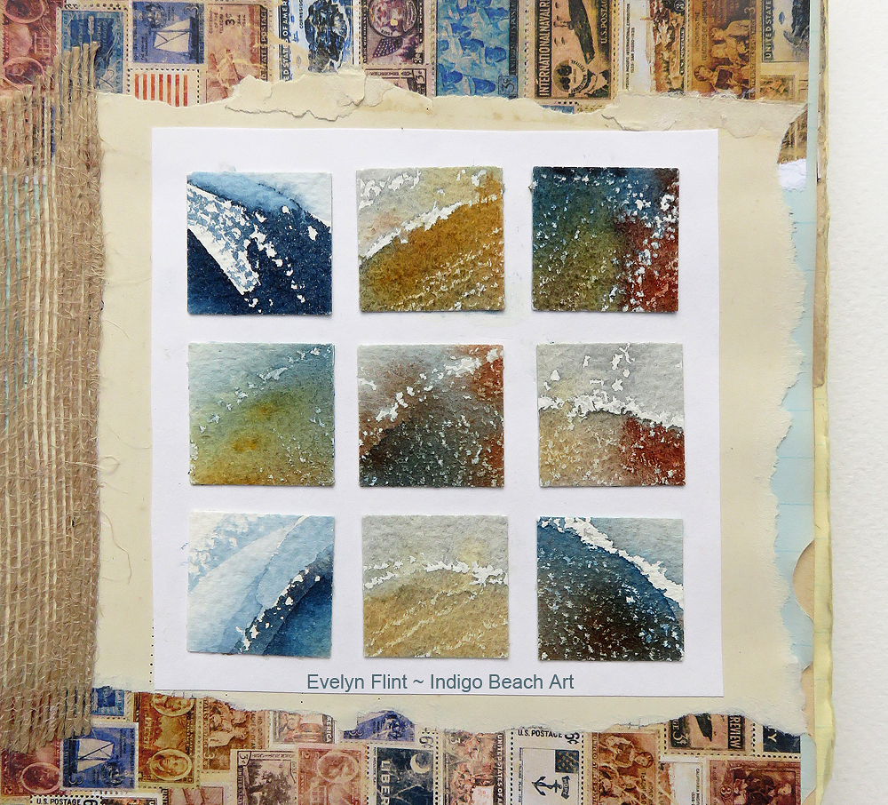
Above, the colours are Monte Amiata Natural Sienna and Prussian Blue, plus a very tiny amount of Gold mica powder. I see them as landscapes and seascapes…
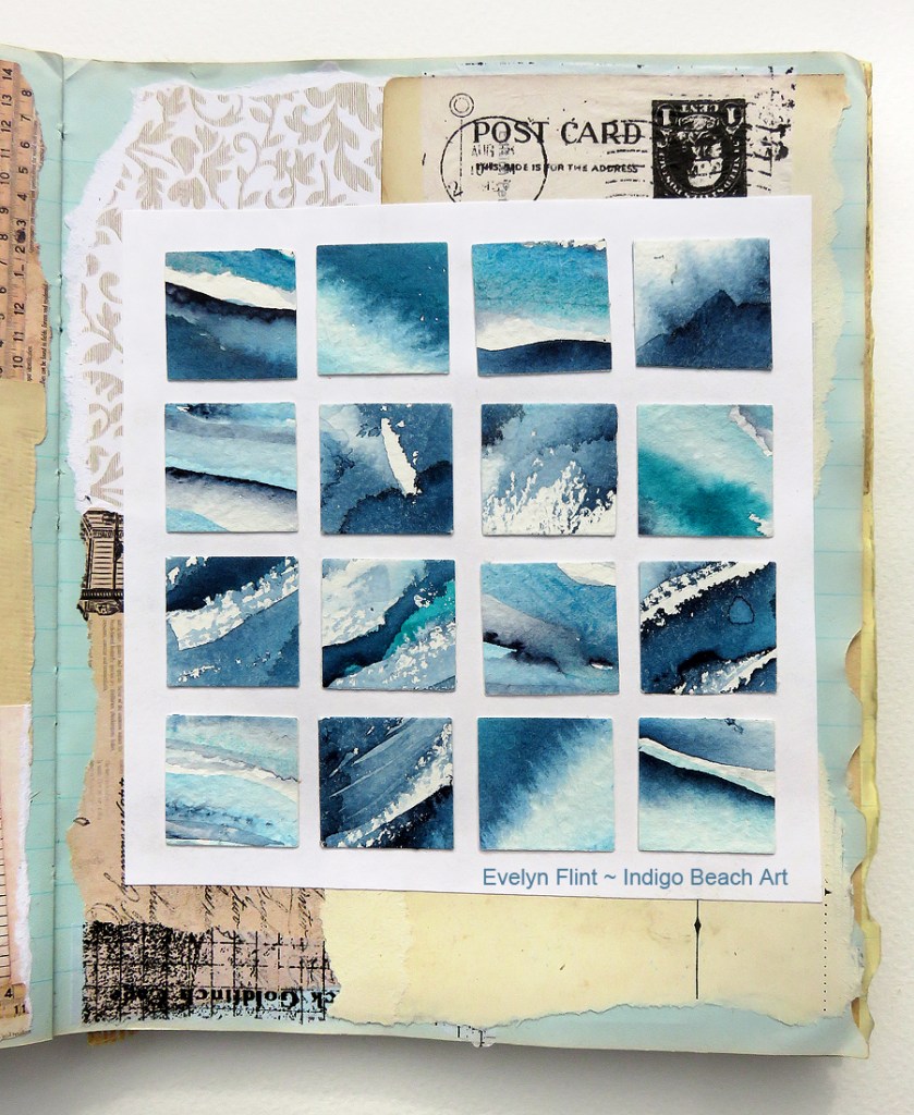
Below we have varying tones of Indigo, along with Cobalt Teal Blue and Manganese Blue Hue. All beautiful abstract seascapes and landscapes that inspire me.
Now we come to the very unique sketchbook I have put these abstract watercolours into. This sketchbook started life as a vintage notebook that I bought in a charity shop a number of years ago; it dates from the 1970’s.
I decided to remove some of the pages from this notebook to “thin it out” a bit. Then I set about collaging all the remaining pages with vintage collage items from my collection. It took me about 3 hours (and several glue sticks!) to collage all of it. I ended up with a totally unique, one-of-a-kind, sketchbook. There isn’t and never will be another one exactly like it ever. I like that.
This sketchbook is full now. Two thirds of it are watercolour sketches and the other third is some of my early acrylic and mixed media work. I’m going to look out for another vintage book I can turn into a sketchbook…