Pebble Gallery

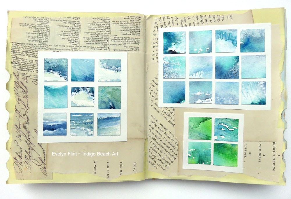
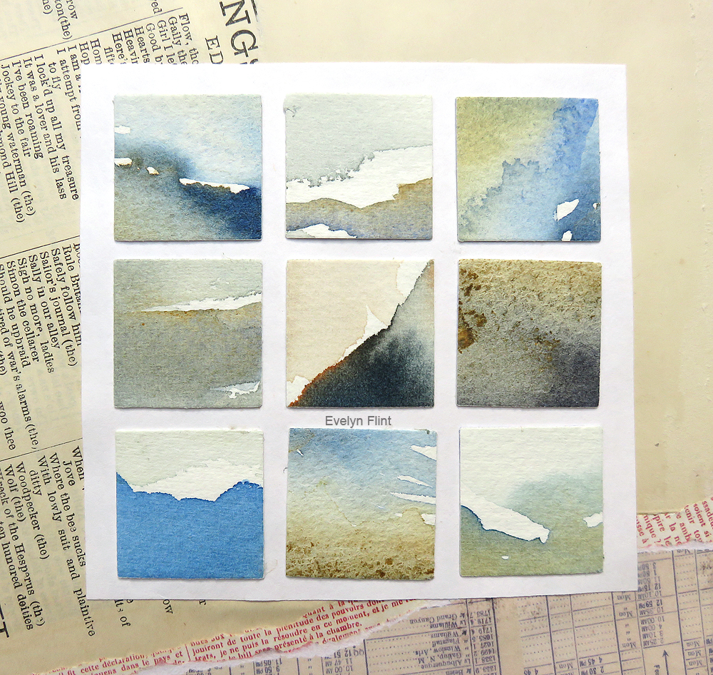
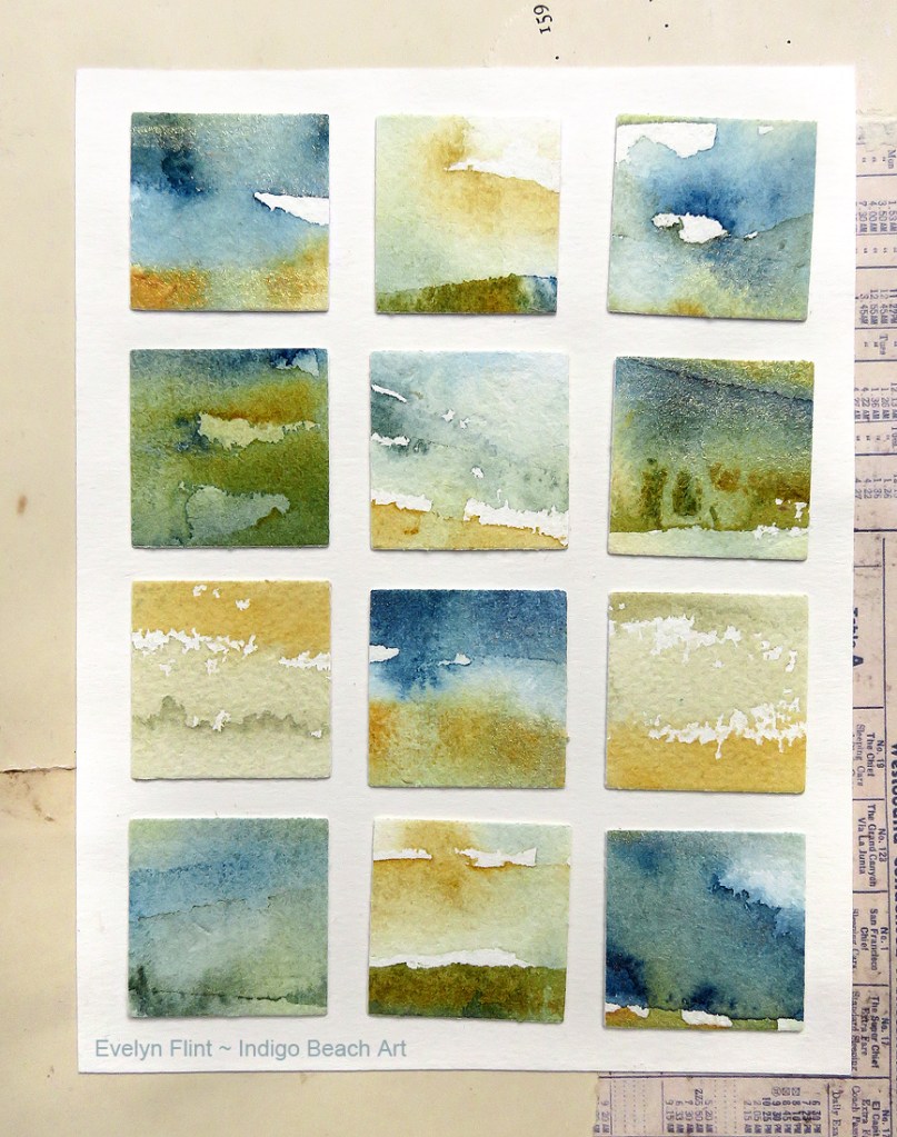
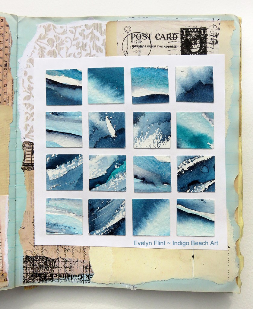
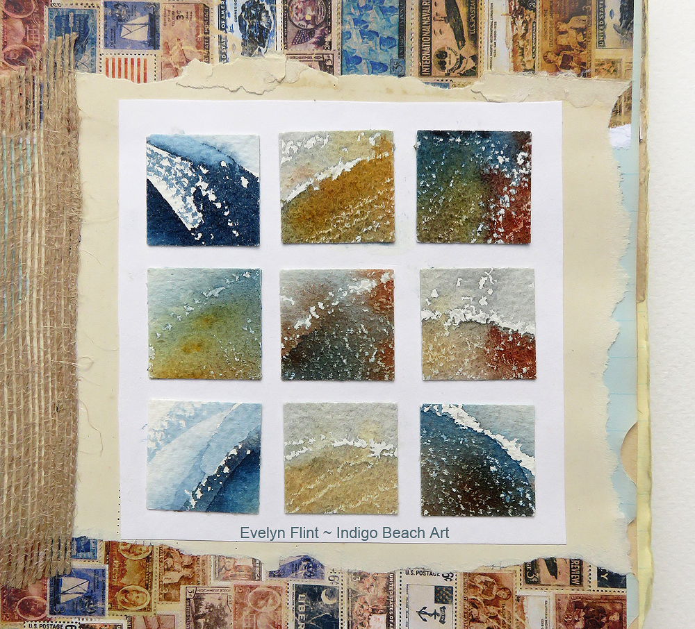
Throughout my watercolour journey, I’ve always loved painting interesting pebbles I find on the beach. I love the colours, textures, patterns and shapes. Below is a gallery of them:

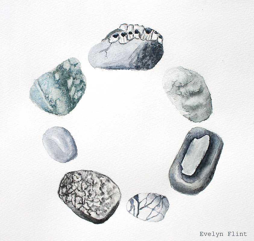
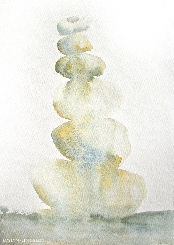
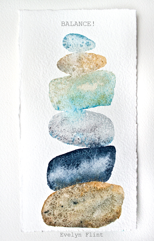
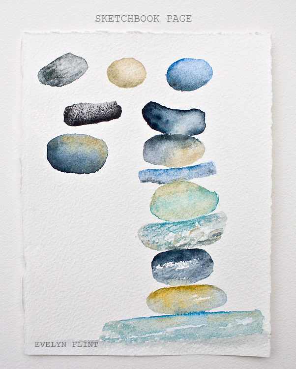
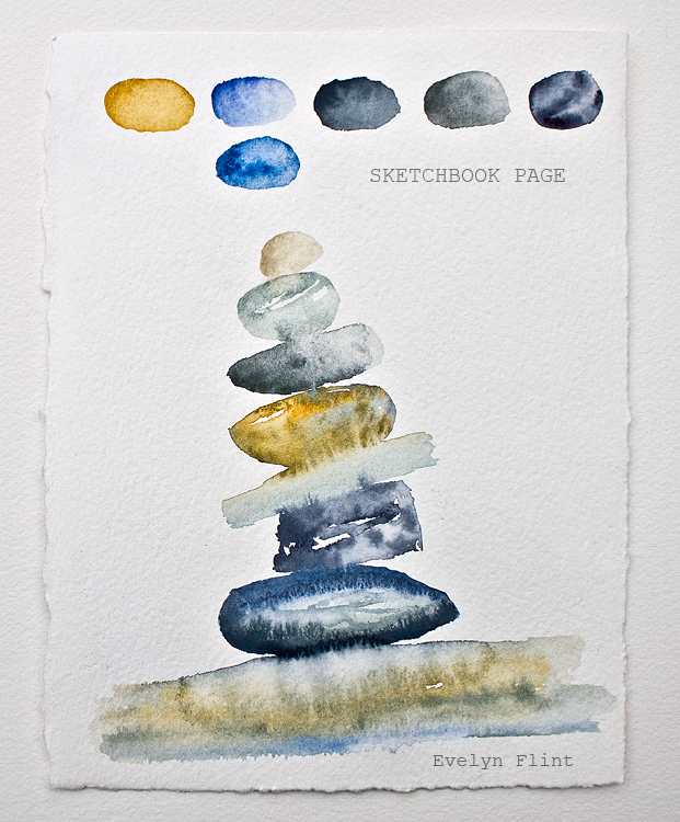
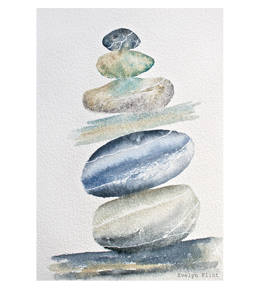
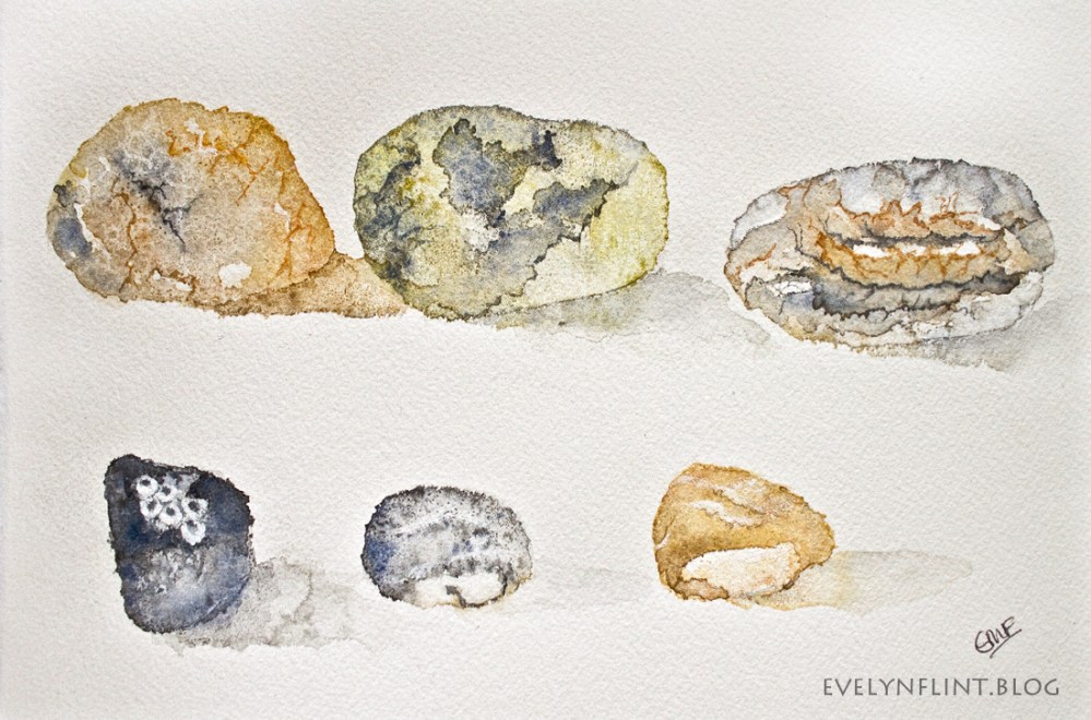
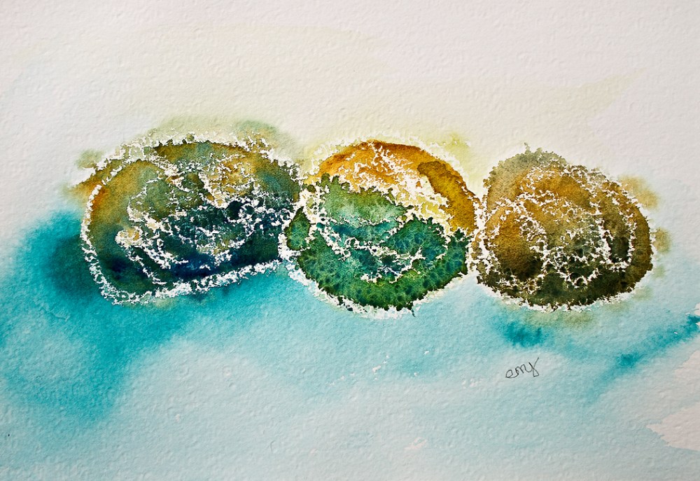
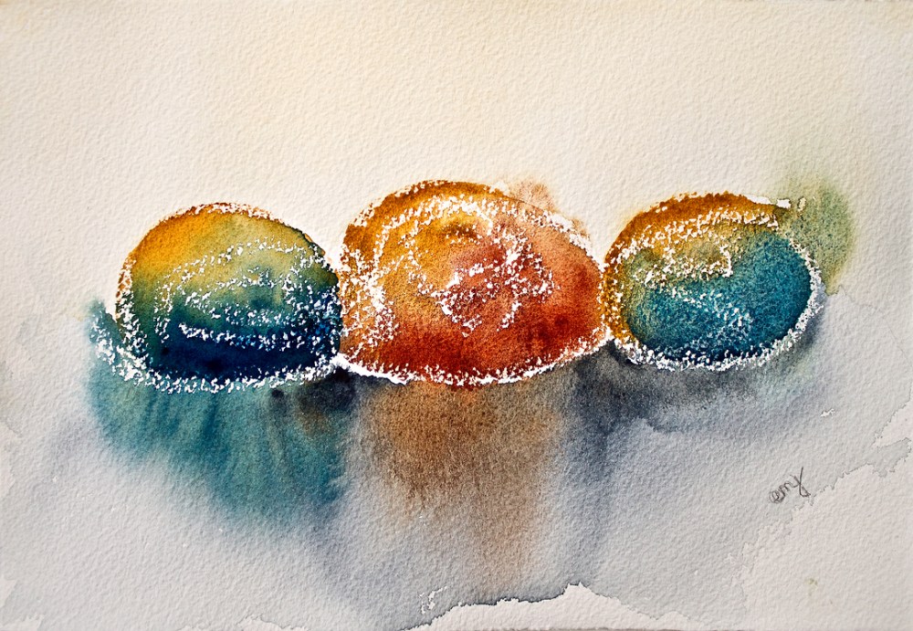
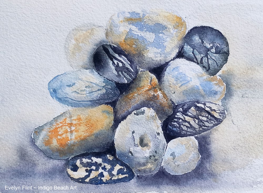
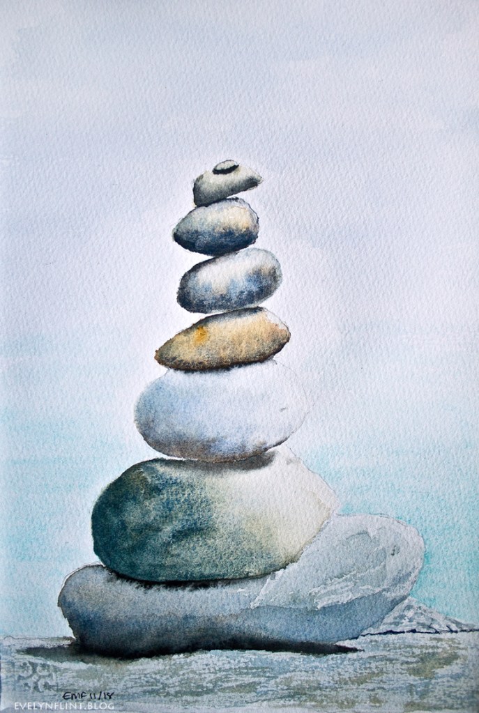
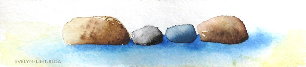
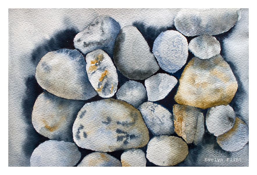
Some of the pebble paintings above are my early watercolour sketches, some are newer and some are sketchbook pages.

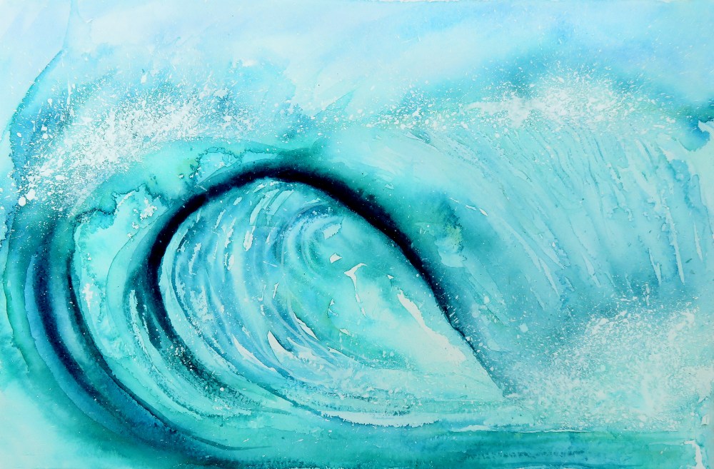
I love painting anything connected to the beach. But I’ve also found that painting pebbles is a simple, very effective way to practice a wide variety of watercolour techniques: wet in wet, wet on dry, dry brush, blending colours, creating 3D shapes on the flat surface of the paper, colour mixing, salt patterns, wax resist, layering washes, glazing, painting details… etc. Once learnt, all of these techniques I can use to paint anything I want…

The techniques I used in quite a few of the pebble watercolours above, I learnt from this DVD by Hazel Soan. It’s brilliant. I can’t give you a link as I don’t know where you can buy it. I highly recommend it if you can find a copy.

I bought this DVD about 6 years ago, but the publishing date on it is actually 2005. BUT the techniques in it, superbly demonstrated by Hazel Soan, are as relevant and valuable today as they were when it was first published; and they will still be relevant and valuable in another 10 years time.

The bottom line is this: Watercolour is timeless. It will never go out of date. Watercolour techniques will never date either. Watercolour will always be a stunningly beautiful medium to work with…

Ocean

The Ocean – watercolour on Two Rivers paper

The Ocean painting above I painted in the spring of 2022. But this is the first time I’ve done a blog post to provide a little more information about it…

The Paper: It was painted on Two Rivers paper, which is a hand made paper made in Somerset, England. The painting measures 14″ x 9″ inches (or 35.5 cm x 23 cm), and it was painted on 200 lb paper with a NOT surface. At this point I have to say that this was THE most heavily textured NOT surface paper I have ever used! Also it is very heavily sized, which can make it more of a challenge to paint on. It is superb quality paper, but it’s not a paper I would recommend for beginners… !

Preparation: I began this painting by doing a very light basic pencil sketch of the wave to make sure I got the shape and size of it correct. I used my Derwent 0.7 mm mechanical pencil, which is very fine and the pencil lines don’t show through the painting. I also splattered masking fluid with a toothbrush in the areas where I wanted the sea spray and water splashes to be. When it was completely dry, I was ready to start painting…

Colours: The colours I used were Indigo, Prussian Blue, Phthalo Turquoise, Manganese Blue Hue and Titanium White. I built the shape of the wave up in about three layers, always making sure that some of the previous layers were showing through. This helped to give the wave some depth. I used some W/N Titanium White watercolour, splattered with a toothbrush, to add more sea spray.

I did go through a stage where I wasn’t happy with this painting. But I just walked away and came back to it several days later. With fresh eyes, I made a few adjustments and decided that it was OK!

Above is another ocean wave painting I did in the very early part of lockdown, spring 2020. Large sweeping strokes of bold colour very quickly covered the paper. I painted this on Arches NOT paper, 140 lb.  Daniel Smith watercolors were used, namely Phthalo Blue GS, Prussian Blue, Green Gold and Cobalt Blue. A little bit of sea spray was added at the end courtesy of a little Titanium White Winsor & Newton designer gouache. It measures 29 cm x 19 cm.

In conclusion, I think that when I start painting I usually have a specific idea in my head of what I want my finished painting to look like. But I just have to accept that, sometimes, the watercolours are intent on doing something different and it’s often best to let them have their own way! Just let the watercolours do their own beautiful, magical thing and don’t fiddle… ! Happy painting.

Abstract Watercolours

In this post I would like to briefly cover two things:

  1. The abstract watercolour mosaics
  2. The unique, one-of-a-kind, customized sketchbook the mosaics are displayed in

Let’s start with the watercolour mosaics. Each of these little squares above are beautiful, original, inspirational, abstract watercolour seascapes. They all started out as larger paintings or experiments that “didn’t go to plan”. All artists have them! I cut them up into 1 inch squares, picked the ones I liked best and arranged them in a grid on some white cartridge paper.

This is a wonderful way to create beautiful, new, original art from those paintings we, for some reason, are not happy with! Each little square can be inspiration for a new larger piece of art. The squares above I see as landscapes. The colours are Ultramarine Blue, Prussian Blue, Raw Umber and Burnt Umber.

Above, the colours are Monte Amiata Natural Sienna and Prussian Blue, plus a very tiny amount of Gold mica powder. I see them as landscapes and seascapes…

Below we have varying tones of Indigo, along with Cobalt Teal Blue and Manganese Blue Hue. All beautiful abstract seascapes and landscapes that inspire me.

Now we come to the very unique sketchbook I have put these abstract watercolours into. This sketchbook started life as a vintage notebook that I bought in a charity shop a number of years ago; it dates from the 1970’s.

I decided to remove some of the pages from this notebook to “thin it out” a bit. Then I set about collaging all the remaining pages with vintage collage items from my collection. It took me about 3 hours (and several glue sticks!) to collage all of it. I ended up with a totally unique, one-of-a-kind, sketchbook. There isn’t and never will be another one exactly like it ever. I like that.

This sketchbook is full now. Two thirds of it are watercolour sketches and the other third is some of my early acrylic and mixed media work. I’m going to look out for another vintage book I can turn into a sketchbook…