AMETHYST GENUINE

I have an exciting new addition to my palette:

Amethyst Genuine by Daniel Smith

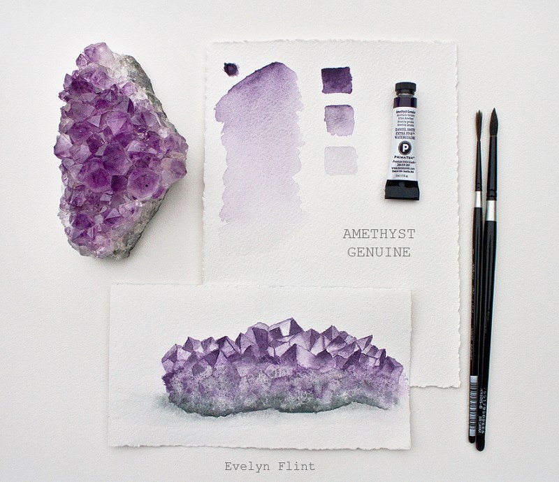
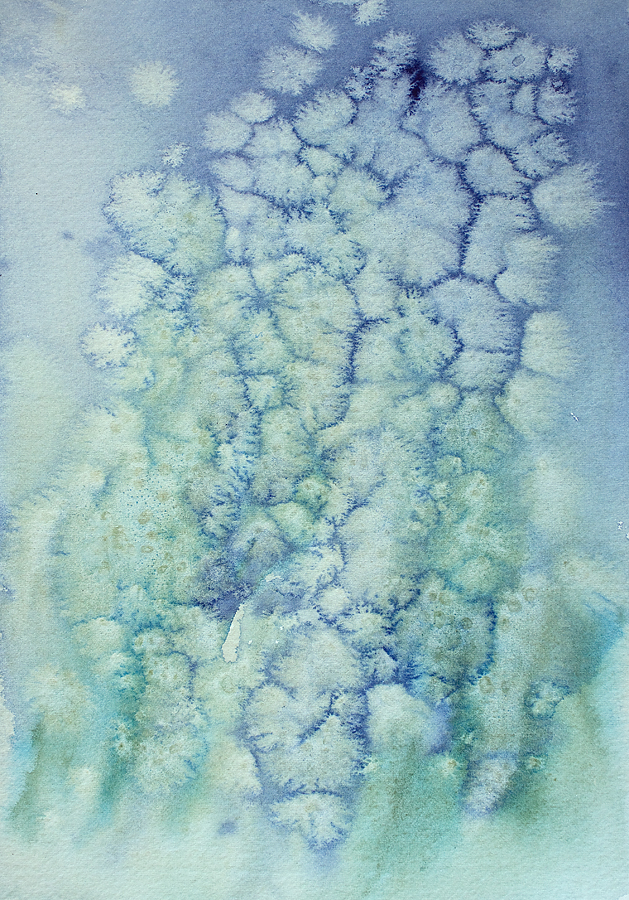
Amethyst Genuine has been on my “to buy” list for a very long time. I don’t really know why it’s taken me so long to try it. But now I have. And it is simply stunning! It may have just become one of my most favourite watercolour shades. Above you can see that I have swatched it out, as I do with all my new watercolour shades. It wont be evident from the photo but this watercolour shade has a very subtle sparkle to it when viewed in a bright light, which is only to expected as this watercolour is made from genuine amethyst.

I have always loved amethyst and have a piece about the size of my hand. So I decided to do a quick watercolour sketch of it using my new Amethyst Genuine. A genuine amethyst painted with Amethyst Genuine – perfect colour choice… !!

Amethyst – a watercolour sketch

This was just a fairly quick sketch done with Amethyst Genuine and Flint Grey for the grey base of the amethyst. I painted this with no preliminary pencil sketch. This is my first ever attempt at painting amethyst. Painting all those dozens of facets can seem quite daunting at first. I painted each facet, one by one! I started with the palest wash of amethyst genuine first, then a mid tone and last the darkest tones.

My Amethyst

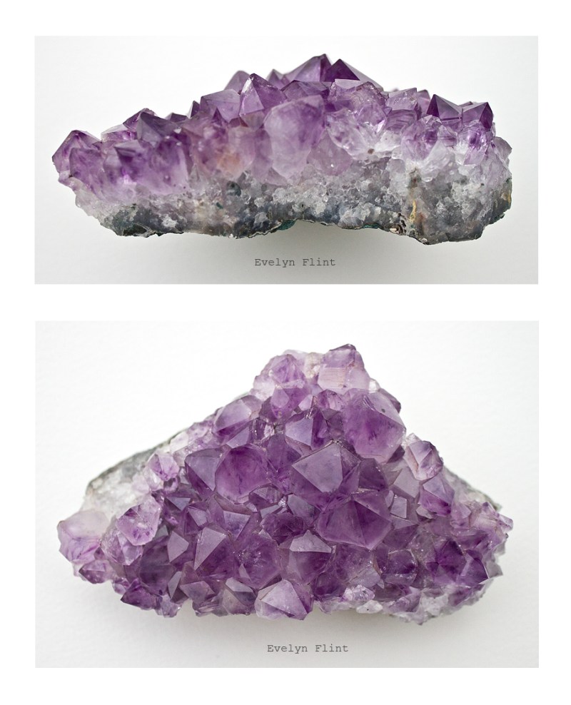
Above is a couple of photos of my amethyst. Apart from the obvious, Daniel Smith’s Amethyst Genuine is a colour I can use for lots of different painting subjects – landscapes, skies, shadows, still life, architecture, florals – it’s uses are endless. It is a little bit expensive but if your budget will cope, I highly recommend trying this stunning watercolour shade!

Creating Salt Patterns

Creating salt patterns and deliberate water marks

Above are some awesome salt patterns I created. The colours I used for this wash were Indanthrone Blue and Cascade Green by Daniel Smith. The Salt I used was a coarse grain sea salt.

Creating salt patterns in watercolour is never going to be an exact science but I have found that when creating salt patterns it helps to know the properties of your paints – ie. whether they are Transparent, Semi-transparent, Semi-opaque or Opaque. The transparent paints generally create good salt patterns because they are made up of finer particles that move more readily across the paper. Opaque, Semi-opaque and some of the more heavily granulating paints are made up of heavier particles that don’t move so quickly across the paper – these are much less likely to create very good salt patterns. Also, a coarse/larger grained salt will generally create larger patterns than a fine salt. So it’s good to consider what effects you would like to achieve and then choose your salt type accordingly.

In my wash above the Indanthrone Blue is a transparent paint – hence it has created really good salt patterns. The Cascade Green, however, is made up of two colours – Phthalo Blue GS (transparent) and Raw Sienna, (granulating). The Phthalo Blue part of the Cascade Green has created some salt patterns but the Raw Sienna part less so, probably because of it’s granulating property. So overall the Cascade Green has produced much more subtle salt patterns.

Something else to consider when creating salt patterns, is the type of paper you are using. Cold pressed paper is smoother and allows the paint to move more freely across the paper and creates salt patterns more easily; but a rough surface paper will slow down the movement of the paint and makes creating salt patterns more challenging!

You do need to add the salt to the paint at the right time. If the surface of the paint is very shiny, then it may be too wet. Wait till the shine has gone off a bit, so the paint is still damp but not too wet.

Using salt with watercolour is a very old technique but it’s still a lot of fun and great for creating textural effects. Why not give it a go… ?

SPRING FLOWER STUDIES

Spring flower studies in watercolour

This is a post from my archives, added to my new blog with it’s original post date – 8th April 2020…

Spring is springing very beautifully in my little corner of the world. You can’t lockdown spring! Above are some Buttercup and Forget-Me-Not studies in watercolour. They were painted on Arches Bright White paper, NOT surface, 300 gsm. The paper was torn into 10 cm x 19 cm strips.

Forget-Me-Not studies in watercolour

I used Daniel Smith’s Cobalt Blue for the Forget-Me-Nots, plus a little Cobalt Violet Deep and some Hansa Yellow Medium. Just quick loose studies, trying to capture the essence of the flowers rather than detailed botanical studies.

Buttercup studies in watercolour

Buttercups – weeds or wild flowers? What ever your view, they add a vibrant splash of colour to the environment. For the buttercup flowers I used Hansa Yellow Medium and Cadmium Yellow Medium Hue; for the stems I used Olive Green.

Spring blossom study in watercolour

Beautiful pink Blossom seen on my daily walk. I used DS Quinacridone Rose for the flowers and Undersea Green for the stems. Again, keeping them simple, not too much detail.

I kept all these spring flower studies simple, trying to adopt a “less is more” approach. I loved painting these – they were so much fun to do and a valuable part of my watercolour journey.