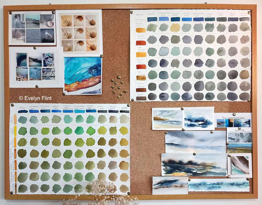
I’m thoroughly enjoying Maria Wigge’s Diving Deeper With Watercolors course! Continuing with getting back to basics, on the course we’ve been encouraged to practice colour mixing. This is something I’ve done a lot of in the past. But I’ve embraced it and done it all over again. By colour mixing I mean mixing a range of colours from different combinations of red, yellow and blue. Maria provided PDF charts for us to fill our with our red, yellow, blue colour combinations. I don’t currently have pictures of mine – I will share those another time. But what I can share now is the two colour charts in the photo above.
Maria strongly encouraged us to create the chart’s above – mixing greys (top right) and mixing greens (bottom left). The greys were mixed from combinations of blues and earth colours. The greens were mixed from just blues and yellows. The colours I used for these charts were all from my studio palette. For this course Maria has simply encouraged us to use the colours we already have – no need to buy new ones! My grey and green colour mixing charts are on the inspiration board in my little home studio, where I can easily see them.
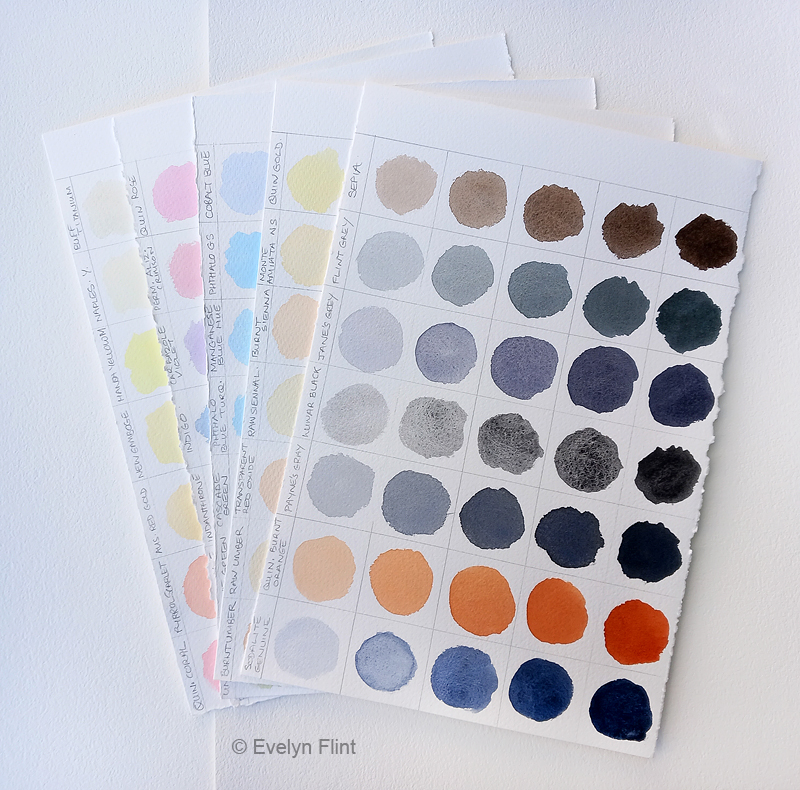
Part of Maria’s “Diving Deeper” course is learning about value. This is extremely important and something I know I need to work on. For a while now I’ve felt that some of my paintings are “missing something” and tonal value is part of the problem. Too many light and mid tones and not enough dark tones. So we were encouraged to make tonal value studies. I created the charts in the photo above. I used the colours from my studio palette, plus a few extra just to fill the last sheet of paper up. I started with the darkest tonal value on the right and worked left with lighter tones. These charts are very useful reference.
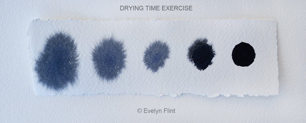
Maria encouraged us to do the exercise above to help us to understand about the drying time for watercolour. Drying time for watercolour is never going to be an exact science! So many different factors affect the drying time – temperature, humidity, being indoors, outdoors, how much water/paint you use etc. For the exercise above I had my colour ready mixed, so I used the same paint for each sample – it was a creamy consistency. In this case I used Payne’s Grey. I wet the paper completely. Starting on the left, with a brush I placed a blob of paint, about the size of a penny, on to the wet paper and then waited for 40 seconds. Then I did the same again. So each of the five blobs of paint above were done 40 seconds apart. Notice how the paint has spread out less with each successive paint blob. The blob on the right didn’t spread at all as the paper had dried by then. Understanding drying times in watercolour is vital. While watercolour is wet it can be worked on, but once it starts to dry it’s better left alone till completely dry. Working on areas of a watercolour that have already started to dry can create messy, muddy marks that can spoil a painting.
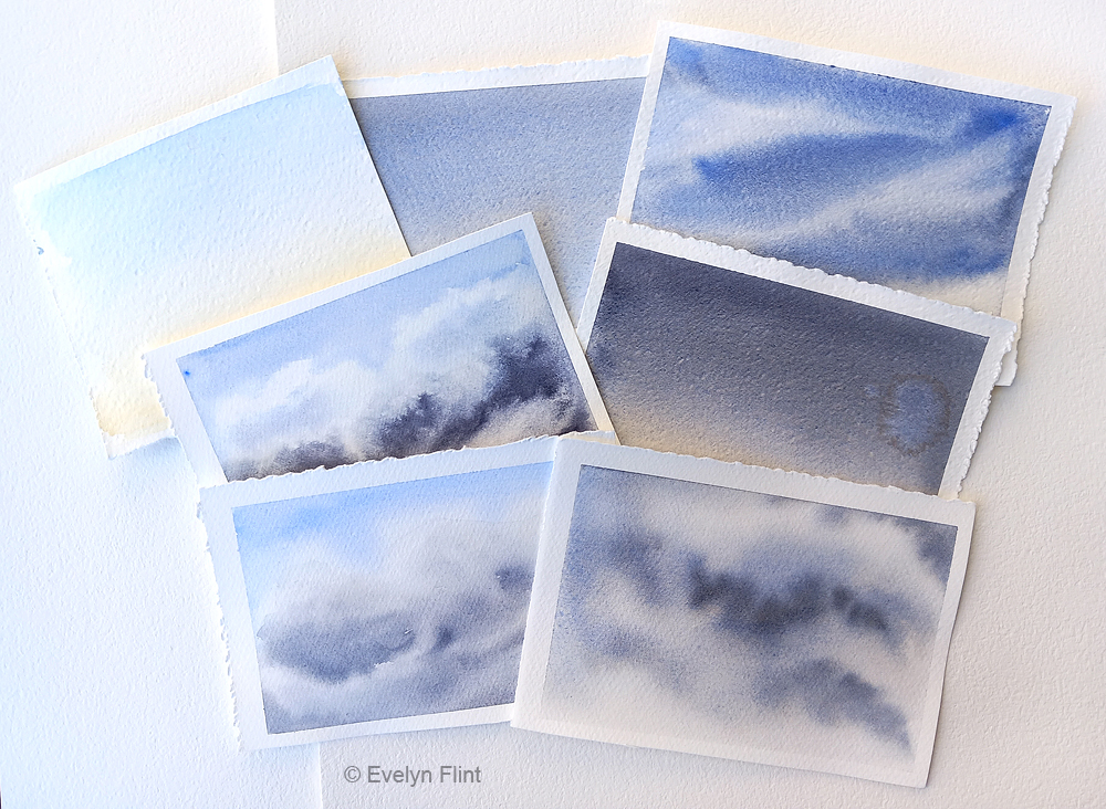
In the course we are looking at each aspect of a landscape individually – skies, water, rocks and trees. Then we will hopefully be able to combine them to create beautiful landscapes. Above are a few of my early sky practices for this course – I have much more to do though… ! Something fundamental to this whole course is PRACTICE. LOTS of PRACTICE. And then EVEN MORE PRACTICE…!
I have also now enrolled on to Maria’s Creating Boldly With Watercolour course too. This course is perfect for beginners who are interested in painting landscapes. I’m not a beginner at watercolour. But I absolutely love this course. The abstract landscapes Maria teaches her students to create in this course are an absolute joy to create. They don’t need hours of dedicated time – just 10 -15 minutes each day. Below are a few of my early abstract landscapes:

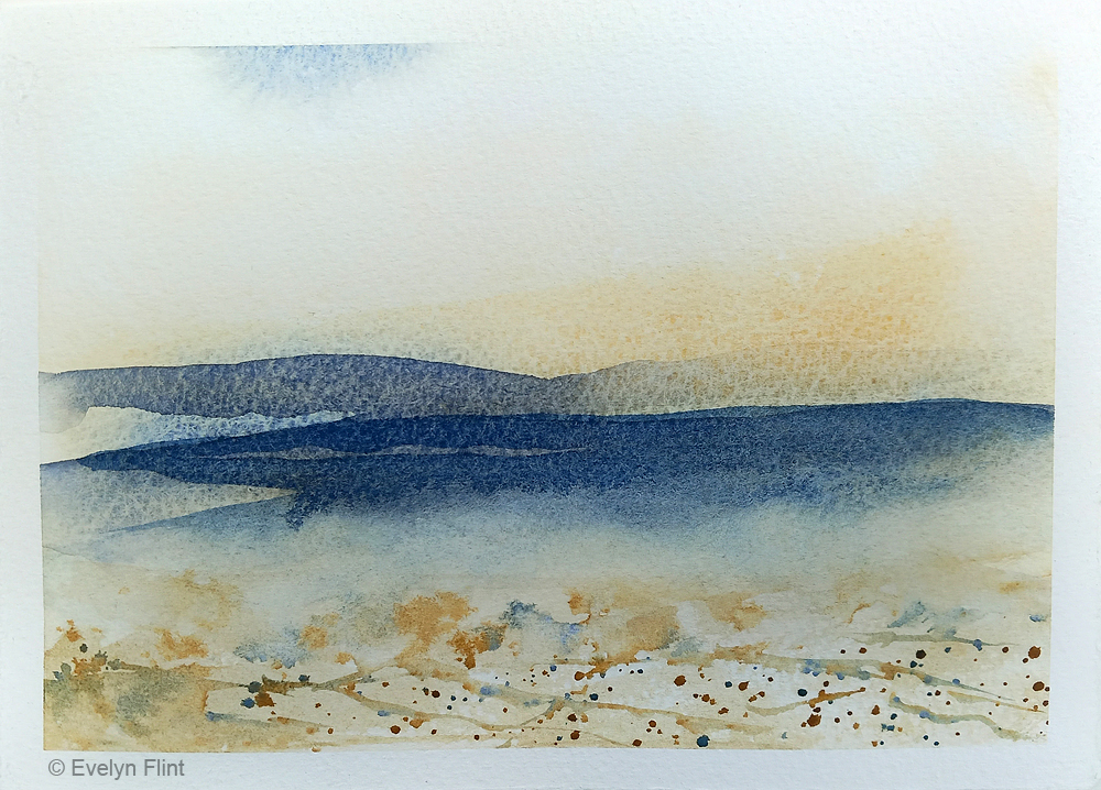
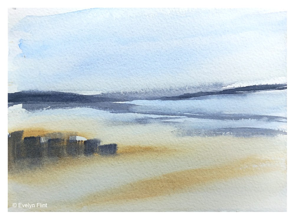
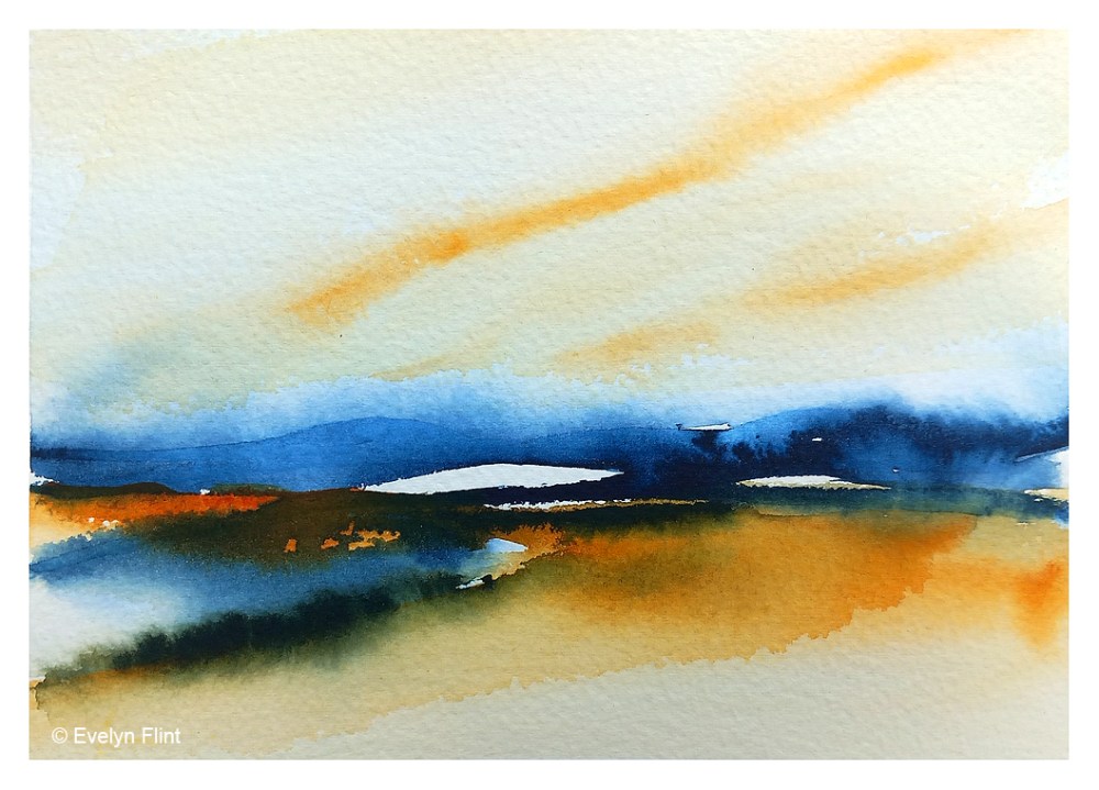
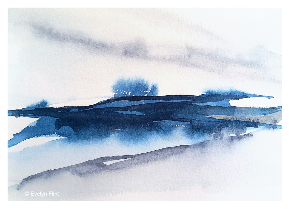

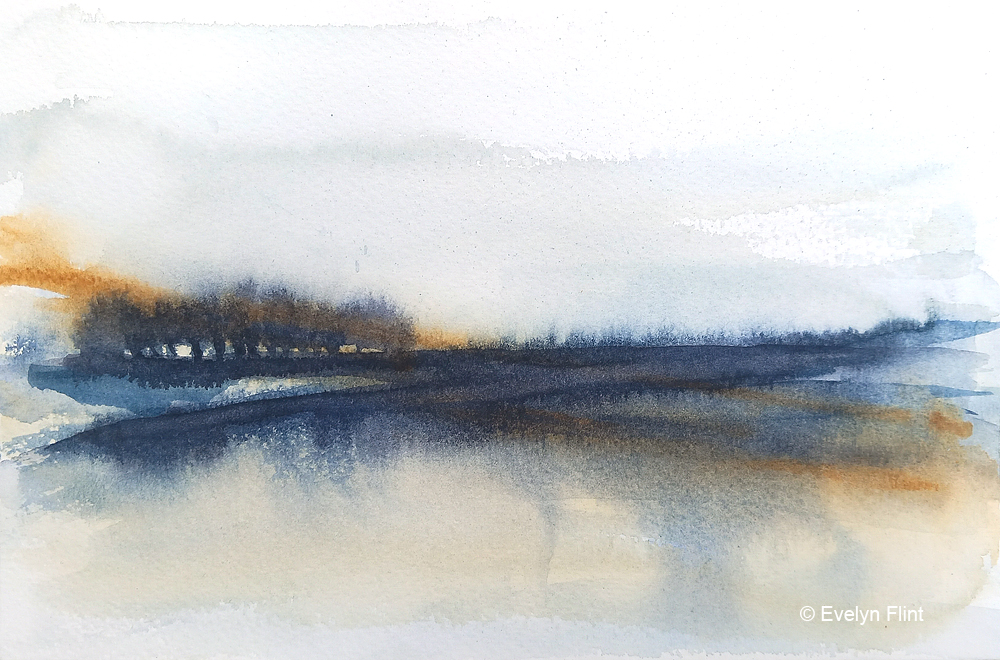
Creating these little abstract landscapes is addictive… ! They are so much fun to do. There’s no pressure to create a masterpiece. And it’s an awesome way to learn watercolour techniques and explore what watercolour does.
There’s going to be a lot more of these abstract landscapes – you’ve been warned… ! Happy painting…!

so sad that I have missed these courses, but I joined the waiting list now.
What paper have you udsed for your exercises, the landscapes and the mixing charts? Do you always use cotton paper for it and/or what is your favorite or recommend paper?
LikeLiked by 1 person
Hi Ina, when these courses open they only open for one week, so you have to be fairly quick off the mark!
The paper I’ve used for the grey/green colour mixes was Arches NOT 140 LB; for the value colour charts I used Milford paper; for the abstract landscapes I used a mixture of Arches NOT, Milford and The Langton Prestige NOT.
I always use 100% cotton paper. My personal favourite is Aquarelle Arches NOT or Rough surface. I do try different papers but always come back to Arches – it’s beautiful to paint on. You can put it in a sink and scrub it if your painting doesn’t work out and re-use the paper!
I would always recommend 100% cotton paper, cellulose/pulp papers are not as good to paint on. I got used to cotton paper very early on in my watercolour journey and now nothing else will do!! As for brand, I think that is a personal choice really. I adore Arches paper but some people don’t… Others I really like are Fabriano Artistico and The Langton Prestige Rough. Hope this helps.
LikeLiked by 1 person
Thanks for the detailed answer, Evelyn, I know that cotton paper is the best choice, but when I do exercises on the expensive paper I sometimes get a “stomachache” 🫣. I always use both sides, as long as it’s just mixed experiments.
Do you buy your paper from Jackson’s Art or do you have a cheaper address?
LikeLiked by 1 person
LOL !! I know what you mean about the expensive paper – the price can give you a nervous breakdown sometimes. But what I’ve discovered is this: when I paint on cheap paper my results are not as good and it’s much harder to work with and it’s so easy to think “my painting skills are awful”; but when I paint on 100% cotton paper it’s much easier to get good results and the whole process is much more joyful – then I realise that it was the cheap paper that was awful and not my painting skills… !! I always use both sides too – every inch… !
I always buy my paper from Jackson’s – in the UK I haven’t found anywhere cheaper and Jackson’s service is excellent. Some websites might seem cheaper on the surface and then they charge you a fortune for postage and they end up being more expensive!
LikeLike
Thank you, Evelyn 💕
LikeLike
I love this colors!
LikeLiked by 1 person
Thank you Laura… !
LikeLike