Abstract Landscapes

Well, it’s been quite a while since my last post. But, in my watercolour world, things have been moving along quietly in the background.

Abstract watercolour landscape

Above is a very simple abstract watercolour landscape on Daler Rowney Langton Prestige 100% cotton watercolour paper. I used just two colours – Ultramarine (Green Shade) and Transparent Orange, both by Winsor & Newton. I love these colours together. The next few watercolours are colour experiments in the form of abstract landscapes…

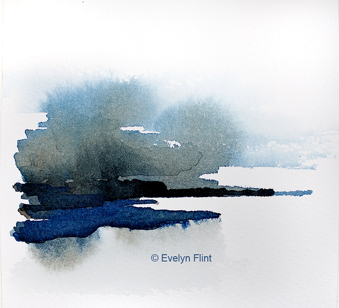
Winsor Blue (Red Shade) and Sepia by Winsor & Newton on Millford watercolour paper.

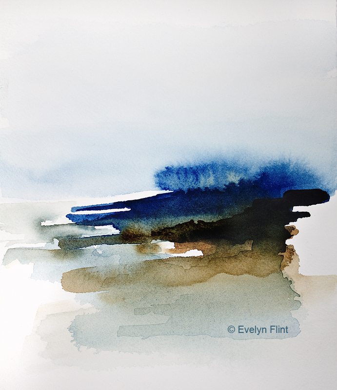
Winsor & Newton’s Prussian Blue and Burnt Umber on Aquarelle Arches cold pressed paper. I love these colours together…

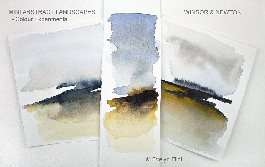
Above left I used Payne’s Gray, Van Dyke Brown and Raw Sienna; in the middle I used Ultramarine (Green Shade), Burnt Sienna and Raw Sienna – this is one of my favourite colour combinations: on the right I used Payne’s Gray, Sepia and Raw Sienna. Paper used was Aquarelle Arches cold pressed.

Driftwood – watercolour sketch
Limpet – watercolour sketch

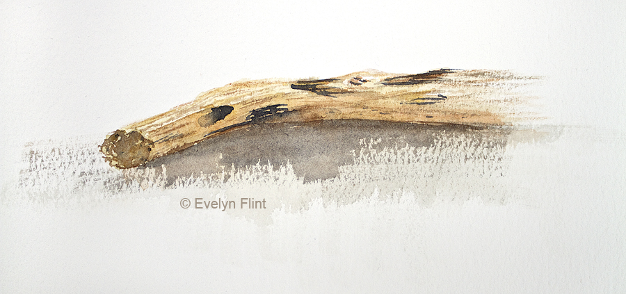
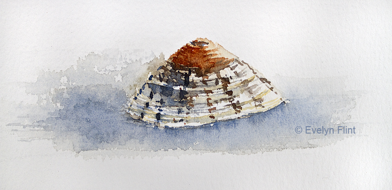
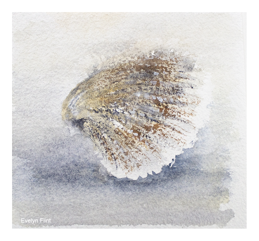
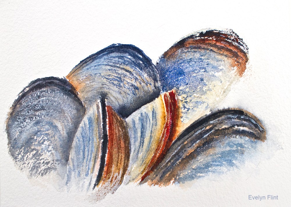
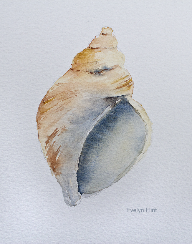
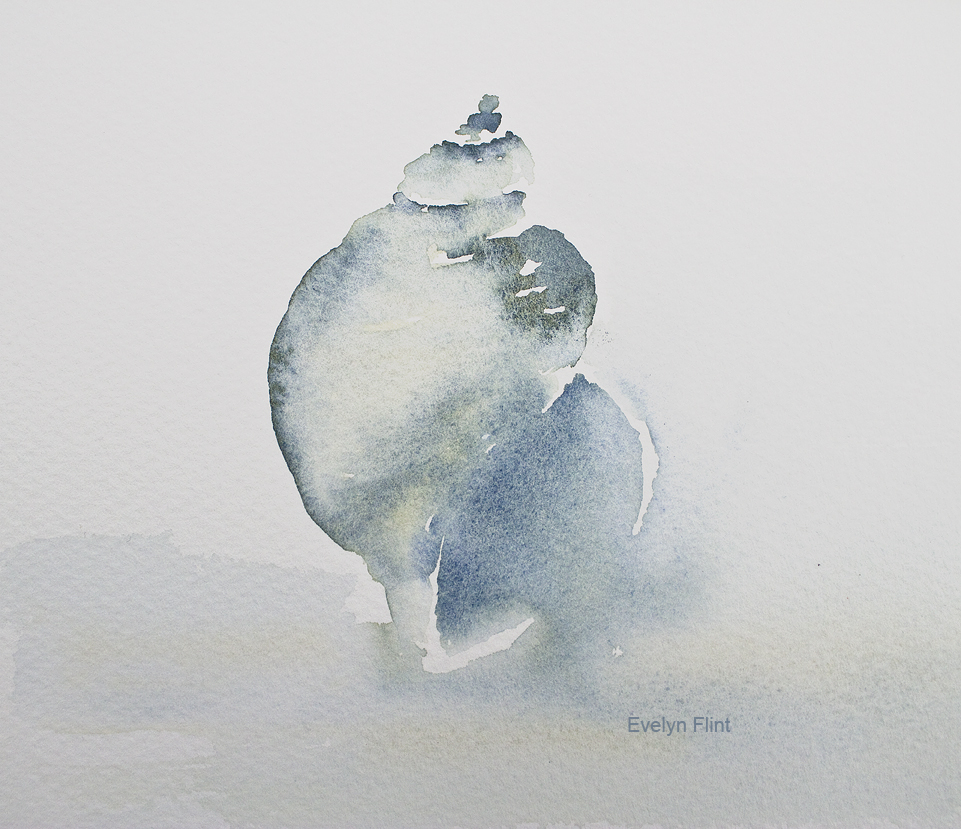
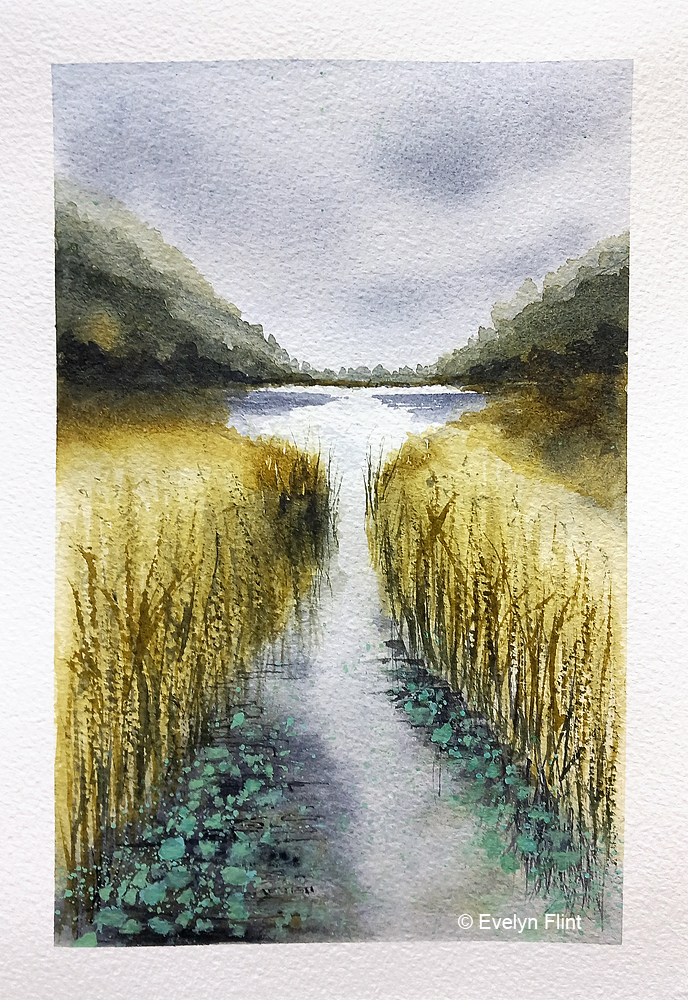
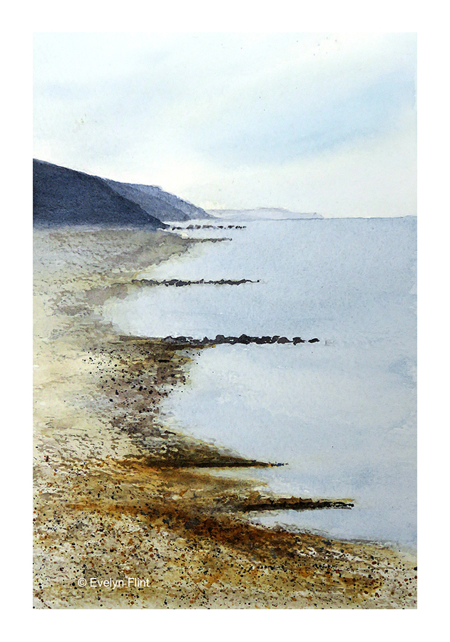
A couple of little sketches of some of my beach combing finds. The colours used were Yellow Ochre Light, Payne’s Grey, Ultramarine (Green Shade), Raw Sienna and Burnt Sienna. The paper used was Daler Rowney Langton Prestige watercolour paper.

I’m still caring for my beautiful mum full time, she will always come first. So my watercolour painting has to take a back seat, and finding time to paint regularly is super challenging. I have to snatch small moments of time here and there, when I can. I’m fortunate that I do have space to paint at my mum’s and my equipment it all set up to be used at a moments notice.

I have updated my Watercolour Materials and My View Of Colour pages, so please take a few moments to have a look. That’s all for now, and I’ll try not to leave it so long before I post again…

Happy painting!

Ravine

Ravine ~ abstract watercolour landscape

Above is a beautiful abstract watercolour landscape painted spontaneously. I used just two colours – Indigo (W & N) and Undersea Green (DS); this is a colour combination I’ve used before and I like it very much. The paper I used is Daler Rowney Langton Prestige watercolour paper, 140 lb rough, 100% cotton. This is lovely paper to paint on.

I’ve also painted a few sea shell sketches:

Cockle Shell ~ watercolour sketch

Above a little cockle shell sketch. Colours used were Buff Titanium, Flint Grey, and Transparent Sienna. The paper used was Baohong Cold Pressed, 140 lb. The lovely texture of this paper is great for helping create the texture of these shells. Negative painting and some dry brush work were some of the techniques I used.

Mussel Shells ~ watercolour sketch

The mussel shells above was a little practice sketch, using one of my own photos for reference. I was testing out colours and creating textures using Baohong Cold Pressed paper and dry brush work. The colours I used were: Ultramarine Blue, Indanthrone Blue, Jane’s Grey, Transparent Sienna, Transparent Ochre and Permanent Alizarin Crimson. I’m going to do more sketches like the one above, applying the lessons I’ve learnt.

Above are a couple of whelk watercolour sketches. The one on the left slightly more detailed, painted on Daler Rowney Langton Prestige watercolour paper; the one on the right painted more loosely on Canson Moulin du Roy watercolour paper.

As a full time carer for my beautiful mum, finding time to paint is challenging. My mum will always come before my painting. But I am able to snatch small moments of time to paint. I’ve had to completely rethink how I’m able to paint now and adapt to my changed circumstances. Recently I have been able to try some different watercolour papers and a few new colours. My watercolour journey will continue…

Course Work

Above is a landscape I painted as part of Maria Wigge’s Creating Boldly With Watercolor course. Maria provided the source photo and demonstrated how to paint it in a loose style. I generally don’t follow tutorials anymore (see below), but I carefully watched Maria’s demonstration and then did completely my own version – I used my own selection of colours and just a very minimal pencil sketch. I really like how this turned out. I showed my sister this painting and she fell in love with it…. so it’s gone to a lovely new home!

Above is a seascape also created as part of Maria Wigge’s Creating Boldly watercolour course, link above. The source photo was Maria’s and she also demonstrated how to paint it in a loose style. But I painted my own version, using my own colour selection and just a very minimal pencil sketch. I have officially now completed the Creating Boldly With Watercolors course, but I will be revisiting it from time to time. I’m now focusing on the Diving Deeper With Watercolors course by Maria Wigge, but I’ll be incorporating lessons learnt from the first course into my work for this course.

Above I mentioned that I, generally, don’t follow tutorials any more. Why not? Because when I follow a tutorial I’m simply copying the work of another artist, and the work created will never be my own work – it will always be the work of the artist who created the tutorial. I don’t want to be someone who simply copies another artists work. Also, the danger with following tutorials is that, if I’m not careful, I will be following tutorials forever…. ! I don’t want to do that either. So I decided some time ago to STOP FOLLOWING TUTORIALS. I like to watch a tutorial to learn techniques and get ideas that I can incorporate into my own work. But that is all. I want to create my own unique, original artwork.

Happy painting!