Shades Of Grey

One hundred and fifteen shades of grey to be exact…

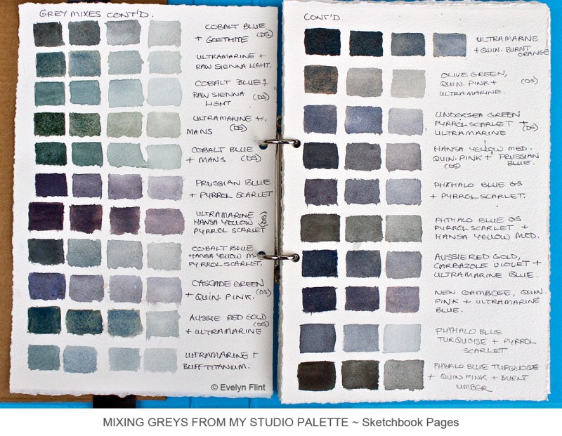
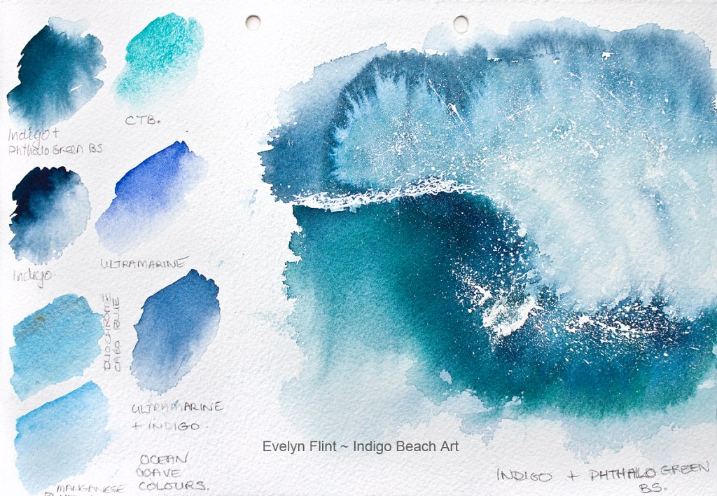
Nearly all these shades of grey I have mixed from the colours in my studio palette. You can see a picture of my studio palette on my WATERCOLOUR MATERIALS page. Since I bought this palette I have reorganized the colours a several times. But I have finally settled on a range of colours that will now permanently form my basic palette. Just for your reference, those colours are:

Buff Titanium, Naples Yellow, Hansa Yellow Medium, New Gamboge, Aussie Red Gold, Pyrrol  Scarlet, Permanent Alizarin Crimson, Quinacridone Coral, Quinacridone Rose, Carbazole Violet, Indigo, Ultramarine Green Shade, Prussian Blue, Cobalt Blue, Phthalo Blue GS, Manganese Blue Hue, Phthalo Blue Turquoise, Cascade Green, Olive Green, Undersea Green, Quinacridone Gold, Monte Amiata Natural Sienna (MANS), Quinacridone Burnt Orange, Raw Sienna Light, Transparent Red Oxide, Raw Umber, Burnt Umber, Sepia, Flint Grey, Jane’s Grey and Lunar Black. All are Daniel Smith watercolours except for the Permanent Alizarin Crimson, Indigo, Ultramarine GS and Raw Umber which are by Winsor & Newton.

Most of the grey shades mixed here are from different combinations of the above colours.  I’ve done a dark, medium and light version of each grey mix and written by each one what colours I’ve used because I have no hope of remembering what they are! This is a really useful source of reference for me. Some are cool greys, some are warm and some are completely neutral.

All 115 of these grey’s are painted over three pages in my newest custom built A4 sketchbook, an A4 ringbinder file which I have filled with Arches paper. There are about 60 pages in my sketchbook and each page is 1/8th imperial size. I have done this because I’m fed up with being disappointed with the paper in ready made sketchbooks. So I’ve built my own and it suits my needs very well.

Greys are beautiful and essential to watercolour painting. Mixing my own means I can create greys that will harmonize completely with the other colours in my painting. How many shades of grey can you mix from your palette?

MAKING WAVES

Ocean practice in my sketchbook

In the image above you can see that I’ve been making waves in my sketchbook! Daniel Smith’s Cascade Green and Winsor & Newton’s Indigo are perfect partner’s for painting the sea in watercolour. They are both beautiful colours on their own but also mix together to make a gorgeous dark turquoise shade. 

I didn’t use a pencil sketch for this wave practice. But I did consider before hand where I would need to leave white paper. I also splattered a little masking fluid in the right area to create some sea spray. At the end I also splattered some Winsor & Newton’s Titanium White watercolour for some more sea spray. Dark areas under the wave help to give the wave some depth.

A page from my sketchbook

For this wave practice I used Winsor & Newton’s Indigo with Daniel Smith’s Phthalo Green Blue Shade – they also mix together to make a stunning turquoise shade. Again I considered where I would need to leave white areas before I began. I also splattered some masking fluid for some sea spray before painting. Notice the watermarks at the top of the wave; I created these deliberately to add a sense of movement, a feeling of the wind blowing across the top of the wave. I splattered a little Titanium White for some extra sea spray at the end. Notice too that in both of the waves I have added some very dilute Indigo into the white area to add some volume and movement to the waves.

I absolutely love Winsor & Newton’s Indigo. It’s stunning and very versatile. It will feature in many more seascapes in the future. Both sketchbook pages above illustrate exactly what sketchbooks are for: they are for practicing, experimenting, making a mess, not worrying if it goes a bit wrong, testing colours, learning lessons. They are a vital part of my art learning process!

INSPIRATION

Artists are often asked where they get their inspriration from. Where do I get my inspiration from? The simple answer from me is EVERYWHERE! Inspiration is all around around us every day, we just have to learn to “see” it.

One of my sources of inspiration is my photo archive. I have been a keen digital photographer for well over 20 years and have accumulated hundreds upon hundreds of photos. I’ve been steadily getting prints made which I have then put into A4 sketchbooks, two of which you can see here. The prints in these books are 7″ x 5″ glossy prints. The mussels photo you might recognize as the one on the front page of my website.

My paintings don’t have to be direct copies of my photos necessarily – I can just use specific elements from a photo or combine elements from several photos to create a painting. It might be the colours in a photo that inspire me or perhaps a photo might bring back memories of a place or time that I would like to capture in a painting. It might simply be the subject matter of the photo that inspires me. My photos inspire me in many different ways.

To capture inspiration anywhere, anytime I always carry a camera with me everywhere! Take a look at the photo below…

The Blues ~ some of my earliest watercolour experiments…

The watercolour samples above are among the very earliest watercolour experiments I ever did! I still have them – they are now glued into an old sketchbook with some other early colour and art experiments. Beautiful blue shades – Prussian Blue, Indigo, Cerulean Blue along with Phthalo Turquoise, Lemon Yellow, Payne’s Grey, Sap Green and Burnt Umber – all by Winsor & Newton. I treasure these beautiful little pieces of my art journey.

Where will you find inspiration today?