Landscapes, Colour Play & Learning

Over the past few weeks I have been busy with my watercolours. My life is very different this year; I’ve had to embrace new challenges but also some lovely new opportunities too. In January, I gave up my job to become a full time carer for my beautiful mum. It is definitely a challenge, but one that I’m more than happy to take on. But on the plus side my lovely mum has allowed me to set up a little make-shift studio in her conservatory, so I can snatch moments of time here and there to paint. Happy days!

Semi Abstract Ink Landscape

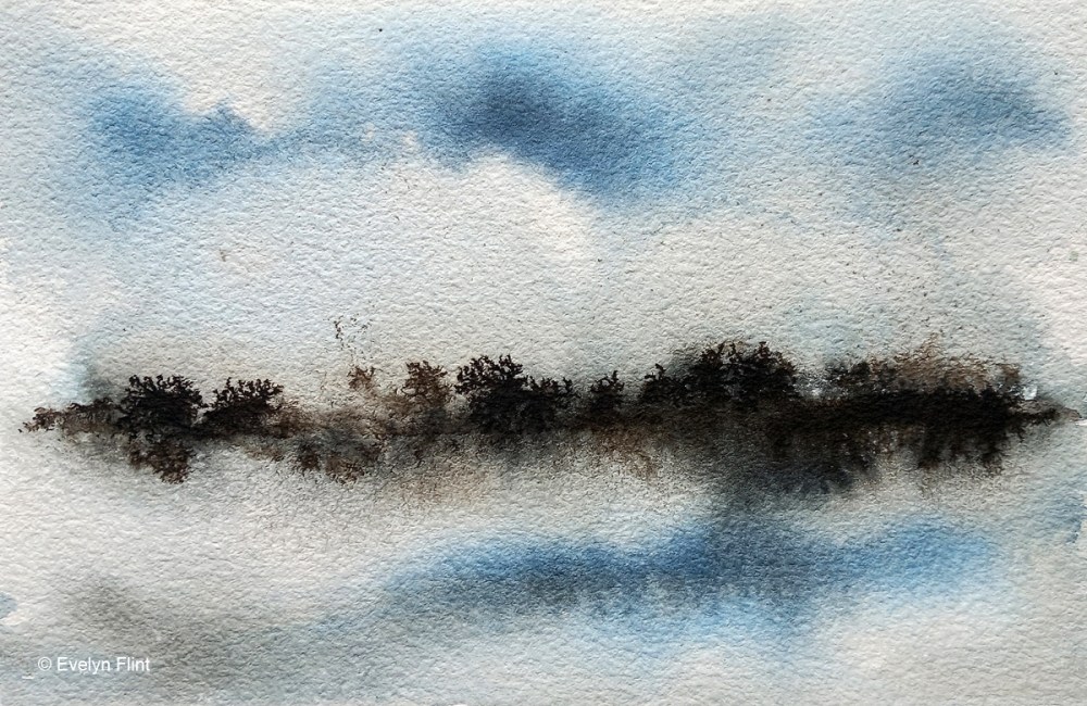
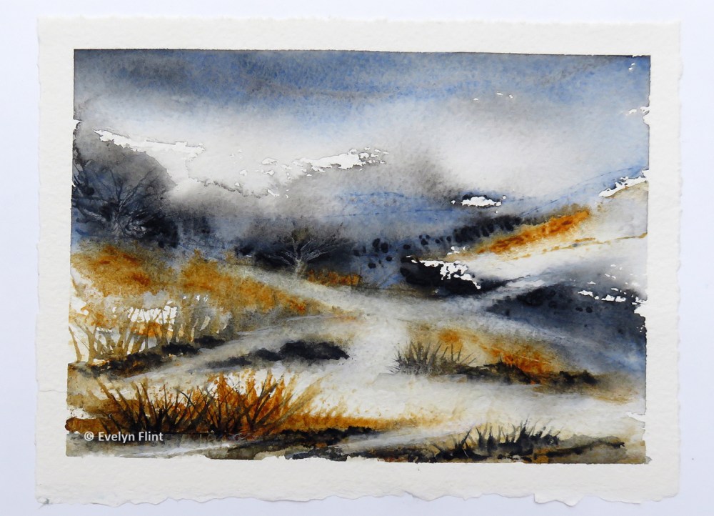
Above is a semi abstract landscape created with ink on Baohong Masters’ Choice watercolour paper. I used Indian Ink – sepia, and Drawing Ink – blue. I’ve also been doing a series of colour experiments. Below is a couple of examples.

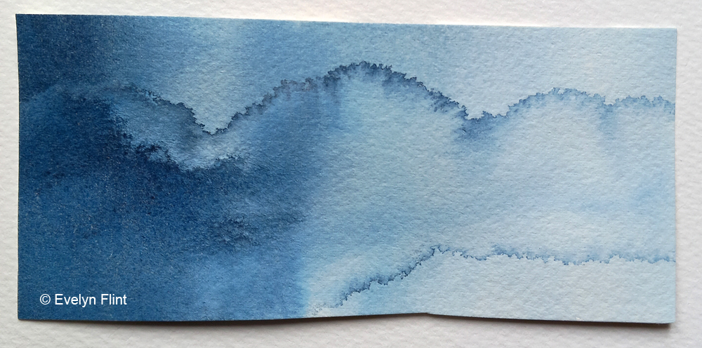
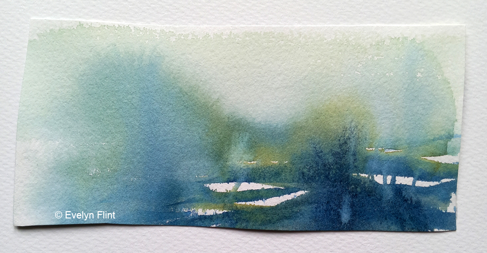
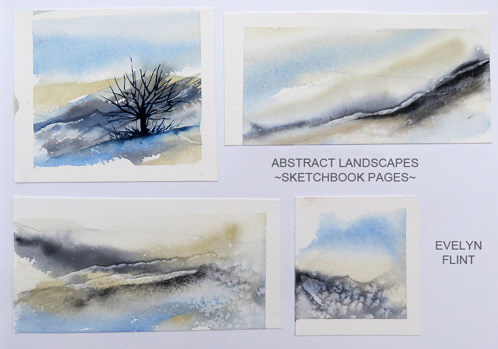
Both of the examples above were just me playing with colours, but I can see hints of abstract landscapes in both of them. The top one is just Indigo and the one underneath is Indigo and Undersea Green. Both these examples will go into my sketchbook, with notes of course.

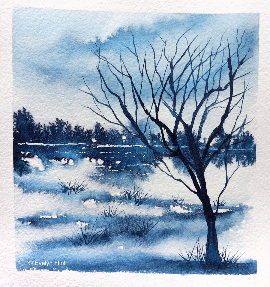
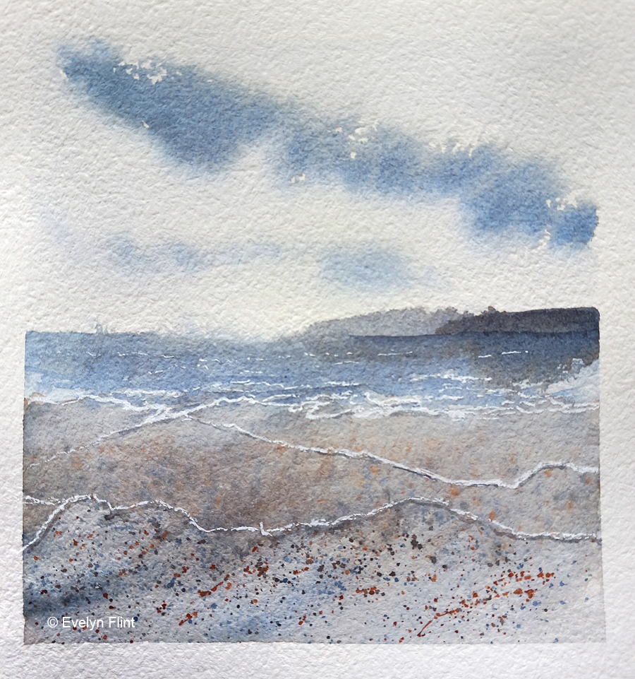
I’ve also done some simple landscape practice…

Indigo Landscape
Seascape – Ultramarine Blue + Burnt Sienna

Last of all, the really exciting news I wanted to share with you is that I have enrolled in Maria Wigge’s Diving Deeper Into Watercolor course. I’m really very excited about this. Maria has a website – https://www.mariawigge.com/ and you can also find her on Instagram – @mariawiggeart. Maria’s art is stunningly beautiful and I am eager to learn as much as I can from her about watercolour landscapes.

In the first part of the course we’re getting back to basics to begin with. We’ve been encouraged to properly get to know the colours we have in our palette. I already firmly believe that this is very important. I have 31 colours in my studio palette at the moment and I know them reasonably well already, but there’s always room for improvement, isn’t there? So I downloaded the sheets Maria provided and began filling them out…

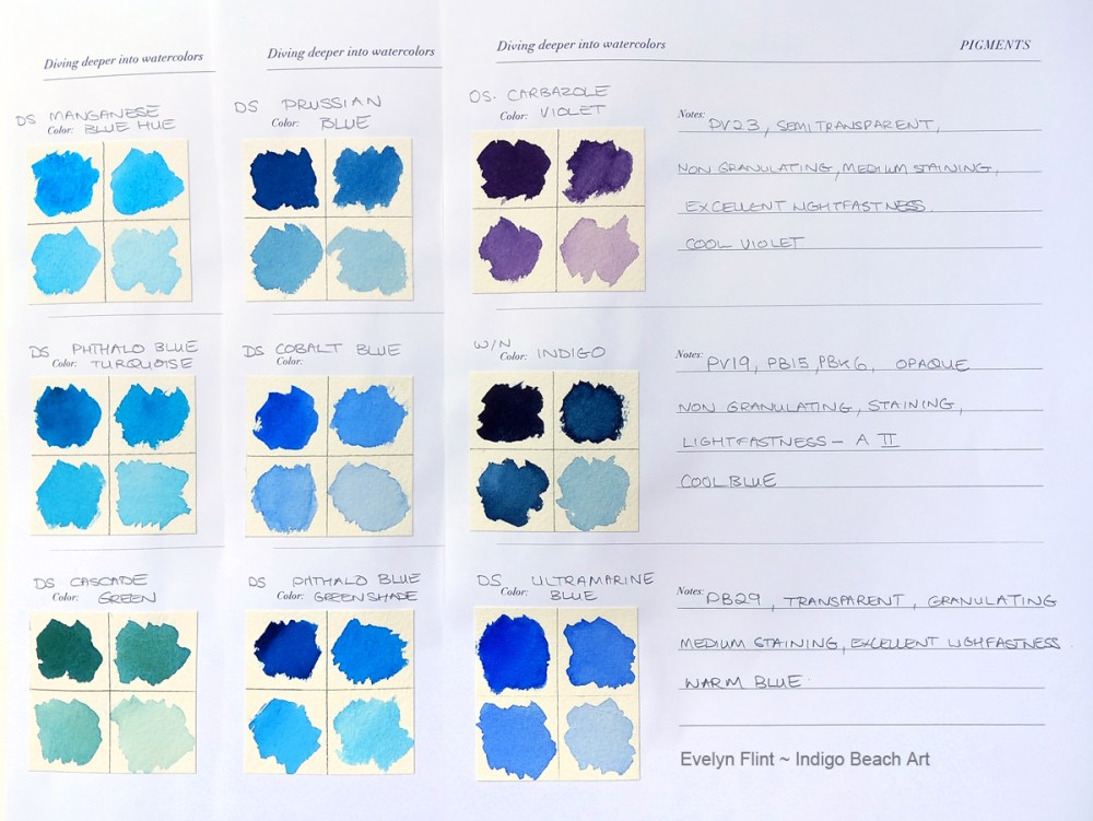
The charts above are an extremely useful reference and I will keep these within easy reach of my desk, so I can refer to them when needed. I love seeing all my colours swatched out like this, it’s made me fall in love with them all over again! I have 11 sheets of colours above and it has taken me a number of hours to create them. But it is worth putting in the time to do this. Over time, I will do this also for the colours in my Secondary Palette too… which will take me many hours, but I will do it.

I will share more of my personal course work in the weeks/months ahead. But I will, of course, NOT share any direct content from the course. You can find out more about this course on Maria’s website. If you are interested in enrolling – do it straight away – enrolment is only open for a very limited time!

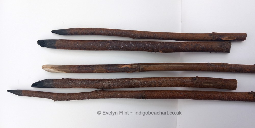
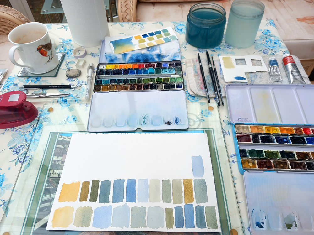
Finally one last photo…

Me creating a watercolour mess in my mum’s conservatory… !

That’s all for now, happy painting!

Ink Inspiration

Ink drawings for my sketchbook

Above are some quick and simple ink drawings which will go into my sketchbook. Inspiration for these came from a tutorial in Lois Davidson’s Patreon group. I’ve been a bit unmotivated with my drawing practice of late, so when I watched Lois’ tutorial about drawing with ink and home made stick pens, I suddenly felt motivated to give it a go. I saw it as a way to inject some extra fun and interest into my drawing practice. And guess what… I love drawing with ink… !! So much more fun than just a boring old pencil…. !! It’s also a lot messier too…

These are the inks I used:

These are the inks I used – Black (Schwarz), Sepia and Petrol (Frieda) by Rohrer & Klingner, a German company. The Black and Sepia inks are Indian Ink and they will granulate if you run water through them on paper. The Petrol (Frieda) ink is a drawing ink and does not granulate. I love the Sepia and Petrol ink together, they’re a lovely colour combination.

I managed to find some sticks and made my own stick pens:

Home made stick pens to use with ink for drawing

I got mixed results from my home made stick pens – some good, some not so good. I will make some more when I find suitable sticks – you really need a hard wood that isn’t going to splinter. But what I did find really good to use were these three items:

At the top is a really old way of using ink – the quill end of a feather! This was really good to use. Next, my favourite so far, a Chinese Bamboo Pen – this was brilliant to use and very cheap to buy. I’m going to buy more of these. The third one is a dip pen with a metal nib – I love using this for drawing fine lines and small details. The Chinese Bamboo Pen I bought from Jackson’s.

I will be doing much more drawing with ink in the future, even though it can be a bit messy (I seem to get it everywhere!). I may acquire one or two extra colours! In my drawing at the top of this post, the two larger drawings were done on cartridge paper and the two smaller ones were done on khadi paper. I am going to try the inks out on my favourite 100% cotton watercolour papers. My drawings will be going into my sketchbook, with notes.

I did mention in my previous post that I would have some important decisions to make early in this year. Well, those decisions have been made. Due to increased family responsibilities, I have had to give up work. I’m now officially retired. I’m nearly 59 years old. My life is very different now and a lot less stressful in many ways. It does also mean I have more time for my art work, if I budget my time carefully. Do I miss going out to work? NO !!! I like being retired… !! Happy days.

Crossroads

CROSSROADS

“CROSSROADS” is a semi abstract, imaginary landscape. It was painted with just two colours – Payne’s Grey (Cotman) and Transparent Yellow Oxide (DS). I used Arches rough paper, 140 lb. I didn’t have a precise plan before painting this, only that it was going to be a loose style landscape. As the landscape emerged through the brush strokes, I felt it needed a pathway. So I added one, then another and finally ended up with a cross roads. This painting is now in my sketchbook. It measures 19 cm x 14.5 cm.

This little painting is significant and very poignant, as I am at a “crossroads” in my life right now. Life has thrown me and my family a “curve ball” in late November 2023. So now I have some big decisions, life changing decisions, to make early in 2024. On the one hand, my future is a little uncertain and daunting as I don’t know yet quite how things are going work out. But on the other hand, there are going to be new opportunities, new horizons and potentially, a better (very different!) way of life for me. I haven’t quite got my head round it all yet! Which path am I going to take on that “crossroads” above?

Above, in my sketchbook, are three abstract landscapes which were inspired by Lois Davidson Art. I have joined Lois’ Patreon Group. The colours I used for these were: Raw Sienna Light, Ultramarine Green Shade, Burnt Umber and Payne’s Grey. I like how these colours work together.

Here we have more abstract landscapes inspired by Lois Davidson. I’ve used a much cooler palette here: Buff Titanium, Ultramarine Green Shade and Payne’s Grey. These colours give me a winter feel, with cool air and maybe a little frost and snow. The landscape in the top left corner is the only one that I have added any detail to. It needed a little something “extra”, and a winter tree was enough.

I’ve only been in Lois’ Patreon group for a very short time and already I’m learning new things and have fresh ideas to move forward with in my art journey. Happy days!