This pile of pebbles have been sat in my studio for some time now, patiently waiting to be painted…
When I had finished painting this, I didn’t like it at all. So I just left it on my desk and walked away from it. When I returned to it a while later, I realised it was not as bad as I first thought. It’s not “perfect”, but not a disaster either! Lesson to be learnt here is to never make hasty judgements about my art. This is one of those paintings that looks better if you view it from a bit of a distance…
The colours I used were Buff Titanium, Flint Grey, Jane’s Grey, Monte Amiata Natural Sienna, Ultramarine GS and Quinacridone Burnt Orange. The paper is Baohong Masters’ Rough, 15 cm x 23 cm. I think this will go in my current sketchbook, as there are things I do like about it and things I can learn from it. I’ll have another go at painting these pebbles. Something else I’ve learnt while painting this, is that it may have been easier to paint this if I had used larger paper… !!
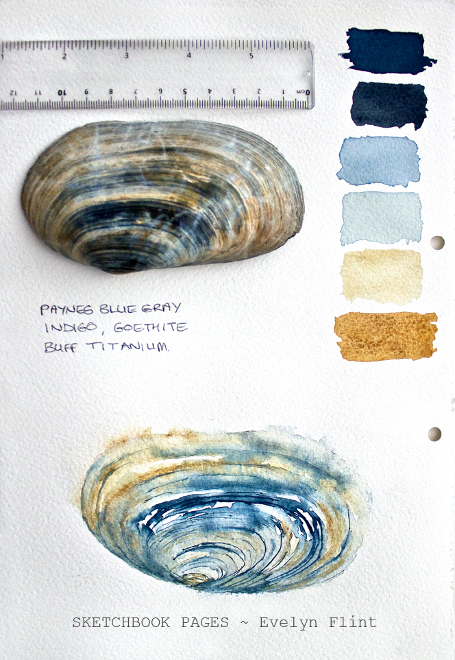
This is my watercolour interpretation of a blue-grey whelk I found on the beach a few weeks ago. I had to wade through a fairly deep, freezing cold rockpool to retrieve this shell!
It is painted on Baohong Masters’ rough paper, 15 cm x 23 cm. Colours used were Buff Titanium, Ultramarine GS, Jane’s Grey and Flint Grey. Also, I painted this about 4 x larger than the actual size of the shell. To help me get the scale and proportions right I used this:
Scale Divider
This is a really useful drawing tool. It’s adjustable, so I can draw things to scale (larger or smaller) in an assortment of different ratios.
Moving forward, lessons have been noted and learnt from these paintings. I will try to put into practice what I’ve learnt in my next painting session…
So many beautiful and inspiring things can be found on the beach. The colours are stunning and the textures are in abundance. The lovely things I find beach combing inspire me to reach for my brushes and watercolours, and make me want to paint…
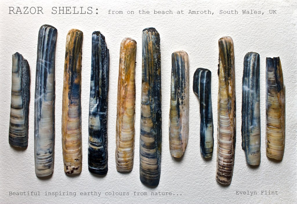
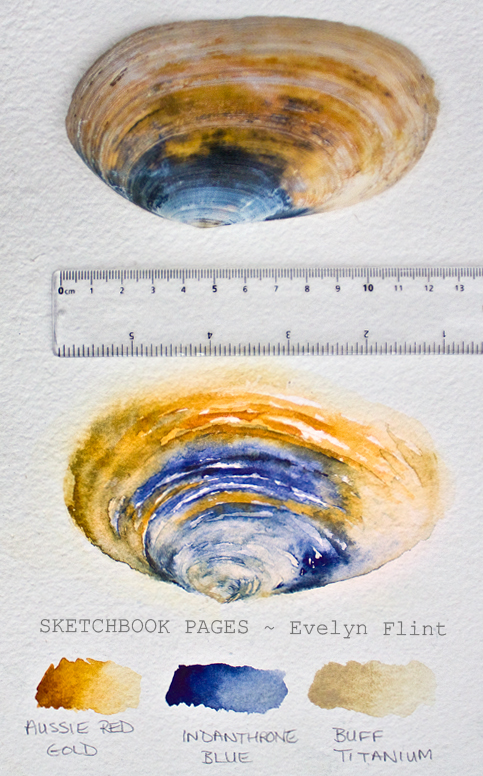
These are some of the more unusually coloured razor shells I found on the beach at Amroth, South Wales, earlier this year…
Aren’t they beautiful, natural earthy colours? In my previous post I went through my colour selection process for painting some of these razor shells. Here are some of my razor shell watercolour sketches…
The basic shape of a razor shell is fairly simple. But they are also gently curved which I have tried to capture with curved brush strokes. The colours and tones were built up in layers, being careful to let each layer dry before adding the next. PATIENCE is needed – this is an important lesson I’ve had to learn with watercolour, and it’s taken me a while… !
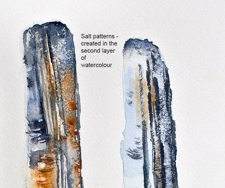
The watercolour sketches above were also done by building up several layers of watercolour paint. I used mostly blue-grey colours and tones, with small areas of earth colours. To get the shapes of the razor shells above I simply put them on my watercolour paper and very lightly drew round them with a pencil. I also used salt to create some texture in these sketches which you can see better below…
It’s interesting to note that the salt patterns I created were done in the second layer of watercolour, not in the very first wash! I did this deliberately because I wanted the pale colours of the first wash to show through the salt patterns in the darker colours of the second wash. I used just very cheap fine table salt and the delicate texture created is just perfect for these razor shells.
Above are some whelk sketches in lovely blue-grey tones. We actually found whelks this colour at Amroth beach. They were really unusual – I’ve personally never found whelks this colour before. And we only found a couple, so they weren’t exactly in abundance. But I would like to find more!
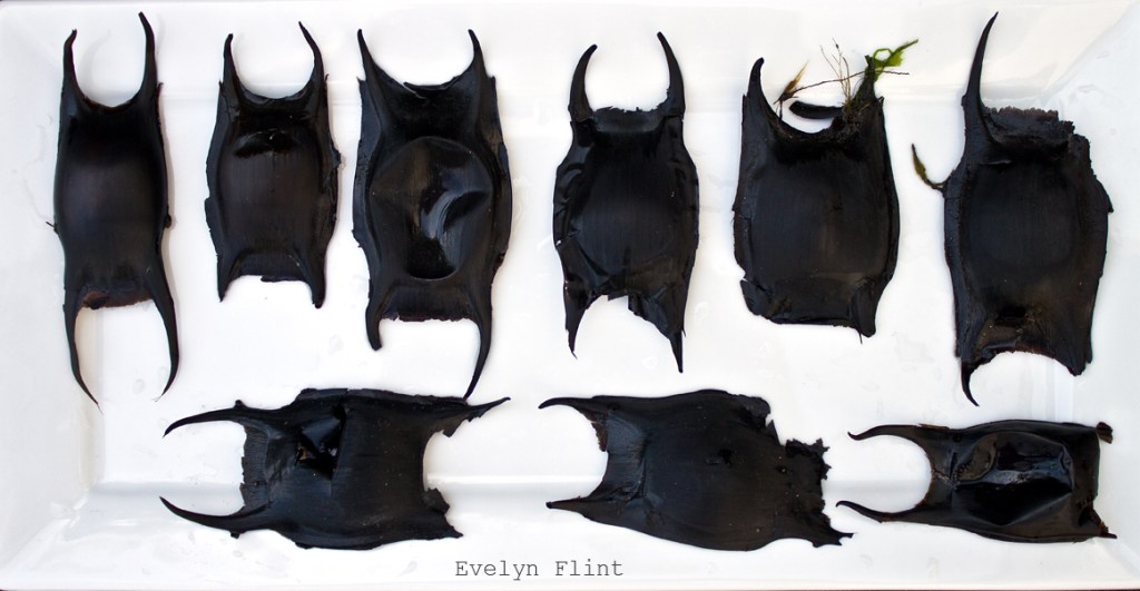
Finally – Mermaid’s Purses! These were really exciting finds for me, they were the first ever Mermaid’s Purses I’ve ever found while beachcombing…
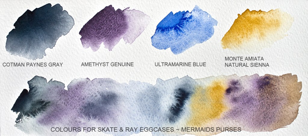
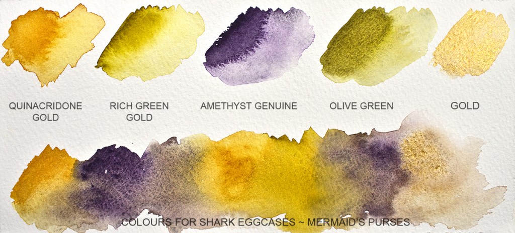
Skate & Ray Egg CasesShark Egg Cases
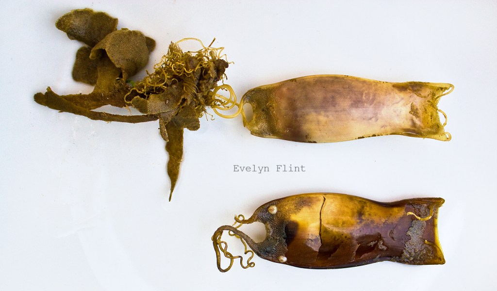
The expression “Mermaid’s Purse” is just lovely! They are actually eggcases. The darker, larger ones above with the horns are skate and ray eggcases, and below them are the smaller green-gold shark eggcases. Exactly which varieties I’ve found I can’t be sure – they can be tricky to identify. But what I do know is that I want to paint them!
What colours do I paint them? With the skate and ray eggcases, it’s easy to look at them and think “oh, they’re black!”. And while it’s true, there are some very dark blackish tones there, there are other colours too. I have the advantage of seeing them in reality and also viewing very large high resolution photographs of them. Along with the “black”, I see blue tones, some mauve and brown tones too…
The shark eggcase colours are more easily identified. I see gold, green gold, mauve tones and some earthy greens, also some brown tones as the mauve mixes into the gold and green gold…
At this stage, these are the colours I plan to use to paint my Mermaid’s Purses. Of course, I always reserve the right to change my mind… !! A little time spent working out what colours to use before painting is always time well spent – less chance of unfortunate colour “surprises”. My Mermaid’s Purses watercolour sketches will go in another post.
Finally, if you love beachcombing as I do, this book is absolutely brilliant:
A brilliant book to help identify my beachcombing finds…
Here in the UK we’re an island nation, surrounded by hundreds of miles of beautiful coastline. I love exploring our beaches, beachcombing, finding interesting things to inspire my art. But a while ago I reached a point where I wanted to know what it is I’ve found. I want to be able to name the different types of seaweed I find, name all the different shells and the sea creatures I find. This brilliant book helps me do that. Slowly I’m learning the names of the different things I find.
This book is written specifically with the UK’s coastline in mind and I love it. As soon as I get home with my beachcombing finds I get this book out and try to accurately identify what I’ve found. I highly recommend this book.
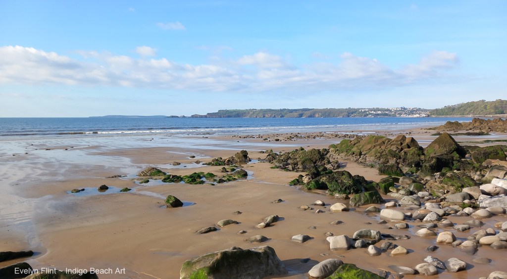
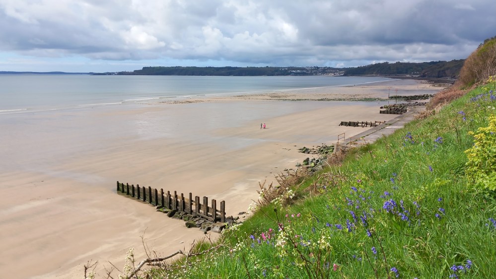
A few weeks ago I had a wonderful holiday with family by the sea in South Wales. We stayed at Amroth, a tiny little village 5 miles east of Tenby. This is a piece of the UK coast I’ve never explored before. I love how the UK coast line varies so much from place to place. Amroth is on the coast of course and when the tide goes out there is a huge expanse of beautiful sand…
The beautiful beach at Amroth, South Wales, UKIt’s among the rocky areas of the beach that the most interesting things are often found…
But it also has rocky, pebbly sections too, with plenty of rock pools. And it’s on these parts of the beach that the most interesting things can be found…
Otter Shell watercolour sketches
Otter Shell watercolour sketches
Above are two lovely examples of Otter Shells found on the beach at Amroth among the pebbles and rock pools. I have done two fairly quick watercolour interpretations of them in my sketchbook. As soon as I find these things on the beach, straight away in my head I’m translating them into watercolour shades. For the first example it clearly had to be blue-grey shades with Buff Titanium and Goethite; for the second, I instantly knew Indanthrone Blue was the right shade of blue complemented with Buff Titanium and swipes of Aussie Red Gold. Notice the ruler placed over the pages, this was just to give the viewer an indication of the size of these shells – they’re big – around 12 – 13 cm in diameter! With each sketch also I swatched out the colours I used for my future reference (I’ll never remember otherwise… !).
There were dozens of these shells on the beach – I don’t know if that’s normal for Amroth or whether we were just very fortunate that week…
Here are the same two Otter Shells painted in the same watercolour shades, but painted using different techniques. Isn’t it interesting how applying the same colours in different ways completely changes the appearance of the shell sketches? Painting these small watercolour sketches helps me to get a feel for the shapes, textures, patterns and lines. And I have to remember, that in painting these shells I am NOT trying to recreate the shells exactly in every detail, but instead I’m creating awatercolour interpretation of them.
Also found on the beach at Amroth were these…
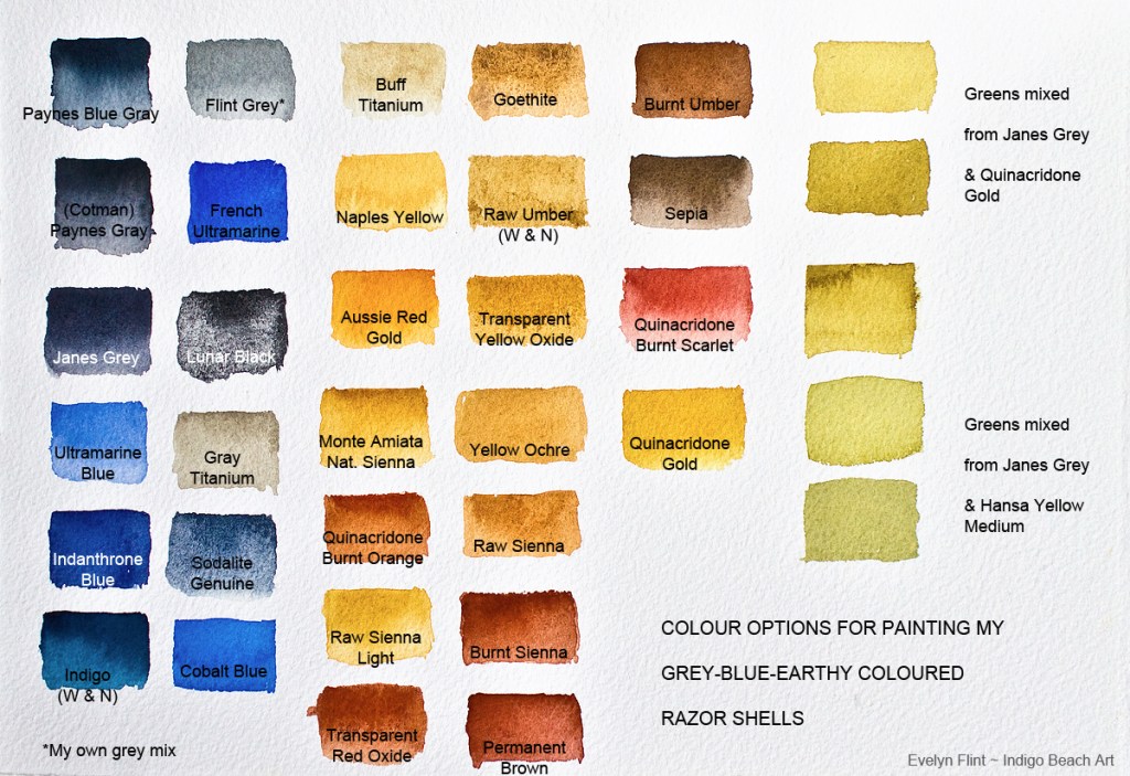
The week we stayed at Amroth there were literally hundreds upon hundreds of razor shells to be found on the beach. We could have collected them by the bucket load every day! Most of them were the very common type you see on most beaches. But I singled these because of their more unusual blue-gray and earthy colours. Aren’t they beautiful? Look at them more closely – the colours and textures are awesome. But how do they translate into watercolour? If anyone struggles with putting colours together in their art, a huge amount can be learnt from studying things we find in the natural world, like these beautiful razor shells. Lets look at their colours more closely…
When I look at these beautiful razor shells, these are the watercolour shades I can “see” in them – dark blue toned greys, a rich assortment of earth yellows and reds and small areas of soft earthy greens. Above are the watercolours I have available to me to paint these beautiful shells. Each primary colour is represented. Obviously, I can’t use all these colours to paint my razor shells… or can I ?? Why not?? All these colours go beautifully together, except for one of them. One of the colours in the chart above sticks out “like a sore thumb” as being completely “wrong”, at least it does to me. Do you know which one it is? The Gray Titanium! It’s completely the wrong shade of grey (not blue toned) and not enough yellow tones in it either for painting my shells. The other colour I can also eliminate is the Cobalt Blue, because I prefer the slightly warmer toned Ultramarine Blue, French Ultramarine and Indanthrone Blue for painting my razor shells.
So, taking time to swatch out the colours above has been a very useful exercise; it has prevented me from using two colours that might potentially ruin my razor shell painting. The soft earthy greens in the far right column I have mixed because none of my ready made greens, utterly gorgeous though they are, are not quite the right shades of green for these razor shells. I do trust my instincts a lot regarding colour. If it’s not right – don’t use it! Learn to trust your instincts… listen to that little voice in your head that nags you when something is not right…
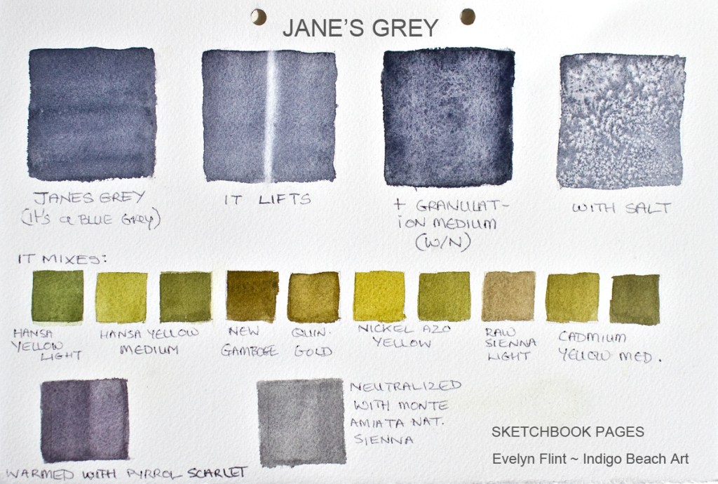
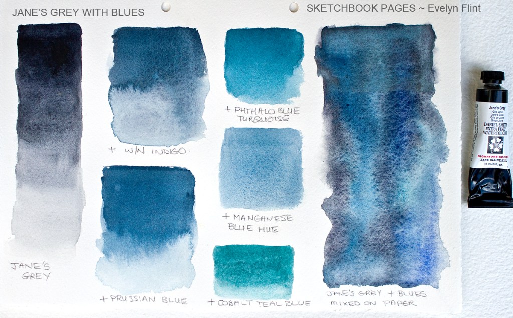
One of the colours in the chart above is a new colour in my palette – JANE’S GREY…
This is a beautiful grey created by artist Jane Blundell and produced by Daniel Smith. When I get a new watercolour shade I always give it a little “workout”, which you can see above. Jane’s Grey has been on my “to buy” list for some time now. I really like it. This grey is a superb alternative to my Paynes Blue Gray (DS).
Jane’s Grey is a blue grey with a subtle granulation. It will lift very nicely when necessary. It granulates beautifully with W/N granulation medium. You can create lovely salt patterns in it – I have used cheap table salt in the example above. It also mixes really well with other colours – it creates lovely clean muted shades. In my “workout” above I have used different shades of yellow to mix with Jane’s Grey and I’ve created some really lovely natural greens. This grey doesn’t create dull colours when you mix with it, like I often get when mixing with Paynes Blue Gray (DS). It’s the black pigment in Paynes Blue Gray that creates dull mixes; Jane’s Grey has no black pigment in it. In my tests above, I have warmed Jane’s Grey nicely with a touch of Pyrrol Scarlet; and I have “neutralized” it with a touch of Monte Amiata Natural Sienna. By “neutralized” I mean that it doesn’t have any bias towards blue (cool) or red/yellow (warm) – it is completely neutral.
Here is Jane’s Grey on it’s own on the left, washed out from dark to light. At it’s darkest it’s almost black but not quite; at it’s lightest it’s a beautiful soft neutral grey, which I love. To the right I have mixed Jane’s Grey with a few blues. This is my favourite:
Winsor & Newton’s Professional Indigo watercolour leans very heavily towards the green side of blue. I absolutely love it! Above however, I also love how mixing it with Jane’s Grey pulls it away from the green side of blue but it is still clearly identifiable as an indigo colour. This illustrates to me that Jane’s Grey can be used as a neutral tint – useful to know. I’m not a lover of standard neutral tint and never use it (that’s another story!) but I do very much like Jane’s Grey and would happily use that as a neutral tint.
In short, Jane’s Grey does exactly what it says on the tin! It does do everything Jane says it does. You can read one of her blog posts about it HERE. When it comes to colour Jane Blundell knows her stuff! Jane’s Grey will now become a permanent resident in my studio and travel palette.
I will do another post for my razor shell paintings and other beach treasures I want to paint and share. To share them now would make this post far too long. In the meantime I want to leave you with a view of the beautiful Amroth beach: